You are using an out of date browser. It may not display this or other websites correctly.
You should upgrade or use an alternative browser.
You should upgrade or use an alternative browser.
Sept. Abstract Challenge (1)
- Thread starter PaintBoss
- Start date
Donna T
Contributing Member
- Messages
- 3,891
One more oddity from me. I used acrylics over layers of transparent watercolor and thin lines of black gesso. I was trying to get more interest with layers and not rely so much on texture. Pushing for some saturated colors is out of my comfort zone but I can find quiet areas in the neutral grays. Curves, angles, the love of color and oddity. Wait, was oddity a theme? 10 x10 acrylic, watercolor and black gesso on watercolor paper.

PaintBoss
Well-known member
- Messages
- 1,525
Jennie your piece reminds me of a slightly psychedlic Christmas tree in a tornado! The drama catches my interest. Like it is whipping around and starting to disintegrate. I like the use of green and colours near the base. It has a story to tell. Cool piece.

Last edited:
PaintBoss
Well-known member
- Messages
- 1,525
Donna I like the painting’s use of colour. I think you are bolder with colour than you think. I like you are thinking of and trying to use several elements. I like the subtle quiet areas and I think they are far more than the grey. Lines, curves, you have struck a wonderful balance in your piece while having lots of interest.You have a beautiful glow with the red and a sense of inner light guiding us almost like into a universe in the middle. I could look at this for quite a while!
Last edited:
 Thank you for the encouragement!
PaintBoss
Well-known member
- Messages
- 1,525
You are welcome. Mine don’t turn out the way I plan it either and I’ve embraced it. Often I think they turn out better! Some people like to plan down to the last little bit, so I guess it just depends on the artist. I like leaving my arms open a to what can happen. Its a fun adventure!
- Messages
- 1,656
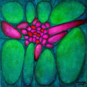
I'm going to use that thought as a quote. This image came from the same class. Method was to take a clipart like image and make it your own. I enjoyed it. Digital edits have been fun too.Jennie your piece reminds me of a slightly psychedlic Christmas tree in a tornado! The drama catches my interest. Like it is whipping around and starting to disintegrate. I like the use of green and colours near the base. It has a story to tell. Cool piece.
PaintBoss
Well-known member
- Messages
- 1,525
I just want to let you all know I am around but unable to do any art right now. I took another bad fall on Saturday. Really hurt myself again. This is sleep related( passing out without warning) repeatedly. Messed up legs and feet, back. Black and blue all over. Thank goodness hubby was home. Despite trying to be careful there are daily situations where this can just happen and I am in a bad spot. We have been trying to do what we can to avoid this but it is not easily worked around due to my situation.
So if I’m not posting work, I just wanted y’all to understand why. But I’ll still be around on the boards eager to see your work.
So if I’m not posting work, I just wanted y’all to understand why. But I’ll still be around on the boards eager to see your work.
Hermes2020
Well-known member
- Messages
- 1,936
Christine, I was going to say that I was really sorry to hear about your fall, but got distracted by all the noisome background noise. Please take it easy for as long as it takes. It is remarkable how you have still continued your constructive and instructive comments on our contributions. 
Hermes2020
Well-known member
- Messages
- 1,936
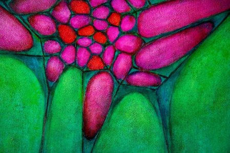
Here is my interpretation of a mixture of the two themes Angles and Curves and Magenta and Phthalo Green. I used my usual Winsor and Newton Griffin Alkyds on a 400 x 400mm hardboard panel.

Some details:

The scarlet-orange spots are to add some punch and variation.

Below I am showing five of many stages to give an idea if the workflow. I used phthalo green and magenta for 99% of the painting, with touches of yellow and rose for accent areas. The glazing medium was W&N Liquin Light gel. The background looks blue, but weirdly enough, that is the result of applying magenta glaze over an under painting of phthalo green. Green areas were darkened by applying magenta glazes, and magenta areas were darkened with green glazes. The stippled textures were made by dabbing on scumbles with a pot scouring pad.

First underpainting.

More underpainting.

Some details:
The scarlet-orange spots are to add some punch and variation.
Below I am showing five of many stages to give an idea if the workflow. I used phthalo green and magenta for 99% of the painting, with touches of yellow and rose for accent areas. The glazing medium was W&N Liquin Light gel. The background looks blue, but weirdly enough, that is the result of applying magenta glaze over an under painting of phthalo green. Green areas were darkened by applying magenta glazes, and magenta areas were darkened with green glazes. The stippled textures were made by dabbing on scumbles with a pot scouring pad.
First underpainting.
More underpainting.
Attachments

PaintBoss
Well-known member
- Messages
- 1,525
I find that absolutely breathtaking. Absolutely beautiful! A Stunner! Now tell me that the two colours cannot work together? Hmmm?  You just busted that thinking wide open. Thank you for showing us the process. I can get lost in this piece. It has a lot of depth and layers. Interest. This reminds me of looking at a stained slide underneath the microscope. I’m thinking of plant cells growing, dividing, humming along. Organic LIFE at the cellular level. What a successful piece this is. You know what I tell people when they hit itout of the par? Frame it!
You sure do inspire me! I hope you’re proud of this piece - you should be.

You just busted that thinking wide open. Thank you for showing us the process. I can get lost in this piece. It has a lot of depth and layers. Interest. This reminds me of looking at a stained slide underneath the microscope. I’m thinking of plant cells growing, dividing, humming along. Organic LIFE at the cellular level. What a successful piece this is. You know what I tell people when they hit itout of the par? Frame it! You sure do inspire me! I hope you’re proud of this piece - you should be.
Hermes2020
Well-known member
- Messages
- 1,936
Thank you for the favourable reaction! I wanted to show that those two colours together don't necessarily have to sear one's eyeballs! My glazing process is slow, simply because I am not skilled enough to achieve that stained glass glowing effect alla prima. I am sure Wayne could give me a lesson in doing it alla prima in a tenth of the time.
Donna T
Contributing Member
- Messages
- 3,891
You finished this beautifully, Hermes! The glowing reds and greens keep my eyes moving around and I can only imagine how stunning this is in person. Does the Liquin gel make the paint dry faster or is it only used to create glazes? I ask because I would like to try glazing with oils but don't know if I can be patient enough to wait for layers to dry.
- Messages
- 1,656
Thanks, the challenge has been a great stimulus for me.This piece is high drama! Really like the floral-like bursts especially. I’m glad you’re having fun with all the experimentation. You can go in so many directions. The clip art was a great jumping off point!
Glad the quote ignited you!
- Messages
- 1,656
Sorry to hear about your fall. The unexpected nature of the events must be hard to come to terms with.I just want to let you all know I am around but unable to do any art right now. I took another bad fall on Saturday. Really hurt myself again. This is sleep related( passing out without warning) repeatedly. Messed up legs and feet, back. Black and blue all over. Thank goodness hubby was home. Despite trying to be careful there are daily situations where this can just happen and I am in a bad spot. We have been trying to do what we can to avoid this but it is not easily worked around due to my situation.
So if I’m not posting work, I just wanted y’all to understand why. But I’ll still be around on the boards eager to see your work.
PaintBoss
Well-known member
- Messages
- 1,525
It sure has been especially the limitations. But I just keep kicking at it. I may have to retreat for a while. But then I push on. Not settle. It’s humbling, but it’s also a master class in being grateful for everything. Every little thing we all take for granted.
Why can’t unexpected events be something like winning the lottery? Lol
Thank you for your kind thoughts.
Why can’t unexpected events be something like winning the lottery? Lol
Thank you for your kind thoughts.
Last edited:
Hermes2020
Well-known member
- Messages
- 1,936
I'm happy to hear that you feel inspired to try glazing, which is a technique I use in most of my painting efforts. Here are a few points that will help you to get started:You finished this beautifully, Hermes! The glowing reds and greens keep my eyes moving around and I can only imagine how stunning this is in person. Does the Liquin gel make the paint dry faster or is it only used to create glazes? I ask because I would like to try glazing with oils but don't know if I can be patient enough to wait for layers to dry.
1. Liquin does indeed speed up the drying process. Another quality of Liquin is that it makes oil paint fluid, so I use very soft watercolour brushes when I glaze. It works best with inherently transparent pigments, although it also manages to increase transparency of opaque ones like Indian Red.
2. Glazing gives great depth to one's colours and allows one to get a glowing stained glass effect I am unable to get with the alla prima application of paint. An example would be getting a rich green by glazing with transparent blue over a yellow ground. Or getting orange by glazing red over a yellow. One of my favourites is Transparent Maroon (PBr25) over yellow. Another interesting experiment is the seeing the unexpected effects of Dioxazine Purple (PV23) over different grounds.
3. It is best to glaze over a completely dry ground, which is frustrating with traditional oils. That is why I favour the fast drying alkyd paints like the Griffin range from Winsor & Newton, since they are usually dry enough after 16 hours. You can also glaze with oils and Liquin over a dry acrylic ground.
3. I suggest painting squares of about 50 x 50mm of all your favourite colours on a canvas and then trying different glaze combinations. You will discover interesting effects, like the difference between blue over yellow, compared to yellow over blue, for example.
4. Once the Liquin has dried for about 20 minutes, take a soft cloth and gently rub away some areas. That will bring out textures beautifully, and give variations in intensity.
5. I find that pale rather than deeply coloured glazes give me more control. Three pale coats work better than one more intense glaze.
Let us know how you get on!
Last edited:
Similar threads
- Replies
- 28
- Views
- 2K
- Replies
- 77
- Views
- 7K
- Replies
- 58
- Views
- 730
- Replies
- 279
- Views
- 5K