You are using an out of date browser. It may not display this or other websites correctly.
You should upgrade or use an alternative browser.
You should upgrade or use an alternative browser.
NOVEMBER, 2021 ANIMAL & WILDLIFE CHALLENGE
- Thread starter Schuee
- Start date
Vivien
Well-known member
- Messages
- 655
Joy - I like both paintings especially the colorful shadow on the 2nd one! Youve painted the frog beautifully in both! Joy you are far too critical of yourself! Be assured your artwork is great. Dont be so critical of it (and I do know we are our worst critics), just enjoy the process of painting and making art!Vivien - I see what Anne and you mean about the softer light. Also meant to comment how I like the effective, but simple way you portrayed the folds of his coat.
My art has been very challenging lately. I had two gos at the lamb, and both were a total mess. So I did two versions of the frog, one sans BG. Originally I had the shadows on that on very dark, and it just looked awful, so I lifted them out. Instead of trying to pain the leaf in detail, I went for a more impressionistic BG. I didn't know what to do with the shadows with a white BG. At least I tried to interpret the photo, but I am getting discouraged. Things rarely look good to me, and I overwork so.
View attachment 13469
View attachment 13470
Vivien
Well-known member
- Messages
- 655
Lovely bright caterpillar, (love those colors) Indy looks so cute in his little Elf coat, and great texture on the birds feathers! Well done on all 3!Here are mine.
Ink and watercolours
View attachment 13474
Ink, coloured pencils and watercolour
View attachment 13475
Ink, coloured pencils and watercolour, with white acrylic eye highlights.View attachment 13476
- Messages
- 2,281
Viv - lovely portrait of Indy! You've made him look so soft and cuddly. I like the ink outline.
Joy - I really like your frogs. I think you are too critical of yourself - I always enjoy seeing your paintings, you have a lovely delicate touch with the paint. My favourite is the one with the green background - I like the various textures and the stronger shadow.
Penny - well done on finishing three! Love the caterpillar - I like how you changed to the yellow background . Indy is delightful. Love all those fluffy feathers on the chick.
Joy - I really like your frogs. I think you are too critical of yourself - I always enjoy seeing your paintings, you have a lovely delicate touch with the paint. My favourite is the one with the green background - I like the various textures and the stronger shadow.
Penny - well done on finishing three! Love the caterpillar - I like how you changed to the yellow background
 . Indy is delightful. Love all those fluffy feathers on the chick.
- Messages
- 2,281
Here's my story: finished pic at the end if you don't want a long read ...
I chose to do the caterpillar. I did this over a series of evenings, starting in a cottage I had to stay in for work. Here's my setup:

It's been that long since I did a painting I wasn't sure what I'd need, so I took everything with me.
Here's the pencil drawing. I noticed the caterpillar in the photo had eaten all his milk parsley leaves so I added one back in. I enjoyed drawing the leaf so much I drew in the whole thing and forgot about my caterpillar, so I had to erase part of it. I also moved the leaf stalk in front of the caterpillar so we could see him.

I also changed my BG colour to yellow, as this is the main colour of the adult butterfly. I painted the rest at home whenever I had time during daylight - I have to paint in the kitchen just now and the lampshades in there have a copper-effect interior, making everything very yellow.
Here's the finished piece. It's watercolour, size A5, Arches 300g CP. I used Windsor lemon, ultramarine blue, indanthrene blue (love this colour - I remembered I had it halfway through the painting), windsor red, lamp black and a touch of raw umber and cobalt violet.

I chose to do the caterpillar. I did this over a series of evenings, starting in a cottage I had to stay in for work. Here's my setup:
It's been that long since I did a painting I wasn't sure what I'd need, so I took everything with me.
Here's the pencil drawing. I noticed the caterpillar in the photo had eaten all his milk parsley leaves so I added one back in. I enjoyed drawing the leaf so much I drew in the whole thing and forgot about my caterpillar, so I had to erase part of it. I also moved the leaf stalk in front of the caterpillar so we could see him.
I also changed my BG colour to yellow, as this is the main colour of the adult butterfly. I painted the rest at home whenever I had time during daylight - I have to paint in the kitchen just now and the lampshades in there have a copper-effect interior, making everything very yellow.
Here's the finished piece. It's watercolour, size A5, Arches 300g CP. I used Windsor lemon, ultramarine blue, indanthrene blue (love this colour - I remembered I had it halfway through the painting), windsor red, lamp black and a touch of raw umber and cobalt violet.
Last edited:
Vivien
Well-known member
- Messages
- 655
Kay - Oh well done! Thank you for posting your WIP leading up to your finished painting! So interesting to see the work that goes into it before! Love your catterpillar! He's munching away busily there, a beautiful painting!Here's my story: finished pic at the end if you don't want a long read ...
I chose to do the caterpillar. I did this over a series of evenings, starting in a cottage I had to stay in for work. Here's my setup:
View attachment 13484
It's been that long since I did a painting I wasn't sure what I'd need, so I took everything with me.
Here's the pencil drawing. I noticed the caterpillar in the photo had eaten all his milk parsley leaves so I added one back in. I enjoyed drawing the leaf so much I drew in the whole thing and forgot about my caterpillar, so I had to erase part of it. I also moved the leaf stalk in front of the caterpillar so we could see him.
View attachment 13485
I also changed my BG colour to yellow, as this is the main colour of the adult butterfly. I painted the rest at home whenever I had time during daylight - I have to paint in the kitchen just now and the lampshades in there have a copper-effect interior, making everything very yellow.
Here's the finished piece. It's watercolour, size A5, Arches 300g CP. I used Windsor lemon, ultramarine blue, indanthrene blue (love this colour - I remembered I had it halfway through the painting), windsor red, lamp black and a touch of raw umber and cobalt violet.
View attachment 13487
ams
Well-known member
- Messages
- 2,151
Joy, I like the work you did on the frog. I think the abstract green background is the more effective of the two. Very nice work showing his shiny, wet skin on the feet and his very prominent eyes. One thing I sometimes do with paintings of animals with a white background is to just ground them with a small shadow that is very dark right where it meets the subject then quickly fades out to nothing. I do the shadows on the animal itself normally.
Here's an example of what I mean.
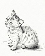
Vivien gives good advice. Don't be so critical, just enjoy the process. You are doing fine.
Penny, wonderful work on all three of yours. I love all the detail on the caterpillar. Indy is obviously ready to go and just waiting for you to open the door! Love the feather work on the bird. It was a very effective technique.
Kay M., what a wonderful story of the painting. I know exactly what you mean about sometimes getting carried away with a background element and developing it beyond where it should be. Wonderful though, that you got so involved that you lost track and just worked away at it. Lovely finish.
Here's an example of what I mean.

Vivien gives good advice. Don't be so critical, just enjoy the process. You are doing fine.
Penny, wonderful work on all three of yours. I love all the detail on the caterpillar. Indy is obviously ready to go and just waiting for you to open the door! Love the feather work on the bird. It was a very effective technique.
Kay M., what a wonderful story of the painting. I know exactly what you mean about sometimes getting carried away with a background element and developing it beyond where it should be. Wonderful though, that you got so involved that you lost track and just worked away at it. Lovely finish.
Last edited:
ams
Well-known member
- Messages
- 2,151
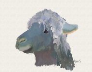
I did two. Both are Artrage digital oils.
My first one was the Alpaca.
I started with a sketch. No real problems there.
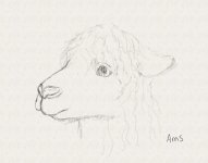
I work in layers on top of the sketch, with the top most layer done first. I started on the hair . Here is try # 1
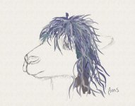
Obviously, that didn't quite work so I tried a different tool which gave better results but I'm not crazy over it.
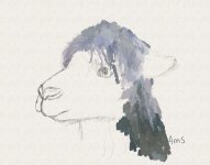
The next step was to do the face and ear.
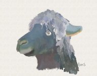
Last step was to do the eye.
The second painting I did was of the bird.
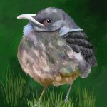
This went pretty smoothly.
Thanks Penny for hosting this month. It was a lot of fun.
My first one was the Alpaca.
I started with a sketch. No real problems there.

I work in layers on top of the sketch, with the top most layer done first. I started on the hair
 . Here is try # 1
Obviously, that didn't quite work so I tried a different tool which gave better results but I'm not crazy over it.

The next step was to do the face and ear.

Last step was to do the eye.

The second painting I did was of the bird.

This went pretty smoothly.
Thanks Penny for hosting this month. It was a lot of fun.
Hawkmoth
Well-known member
- Messages
- 311
Wow, these are all so terrific!!
Vivien - your dog is adorable! So charming and you've handled the bright colours really well. You make it look effortless.
Joy - I'm very self-critical too and prone to feeling disappointed and frustrated (and I struggle with backgrounds too!) so I know how you feel, but these are actually great! I like the one with the background best. To me it looks like it could be moss.
Penny - these are all great, the ink and watercolour technique seems to really suit you! Of course (me being an insect lover) I love the caterpillar best. The zingy yellow background is so unexpected but so brilliant! Love it.
Kay M - I really like your version of the caterpillar too - it's so different from Penny's. It's so stylish and has a wonderful vintage feel. Lovely work. Nice to see your set-up too, and read your comments.
ams - I know nothing about digital art but these look good to me! I especially like the bird, he/she has real substance. I can really feel the weight and fluff of it.
Christel - lovely dramatic swan - very striking. The light on the water is great, it really looks like it's glowing.
I chose the starfish. Size is A5 and I used watercolours + watercolour pencils on NOT paper, plus a wax resist crayon for the water and the texture on the starfish. I'm really pleased at how the wax resist worked.
tanjaf
Active member
- Messages
- 61
Vivien: wonderful painting of the doggie: great expression and pose with minimal effort - I like the contrast between the bold colors of his cape and the softer ones of the dog and background. I don‘t know what pan pastels are - do you apply them with your fingers?
Joy: your frogs are excellent - I was also tempted by him and your paintings are just what I would have wanted to achieve. I like both a lot with a slight preference for the one with background.
Cheers
Tanja
Joy: your frogs are excellent - I was also tempted by him and your paintings are just what I would have wanted to achieve. I like both a lot with a slight preference for the one with background.
Cheers
Tanja
Schuee
Well-known member
- Messages
- 1,976
Thank you very much, Anne.Joy, I like the work you did on the frog. I think the abstract green background is the more effective of the two. Very nice work showing his shiny, wet skin on the feet and his very prominent eyes. One thing I sometimes do with paintings of animals with a white background is to just ground them with a small shadow that is very dark right where it meets the subject then quickly fades out to nothing. I do the shadows on the animal itself normally.
Here's an example of what I mean.
View attachment 13490
Vivien gives good advice. Don't be so critical, just enjoy the process. You are doing fine.
Penny, wonderful work on all three of yours. I love all the detail on the caterpillar. Indy is obviously ready to go and just waiting for you to open the door! Love the feather work on the bird. It was a very effective technique.
Kay M., what a wonderful story of the painting. I know exactly what you mean about sometimes getting carried away with a background element and developing it beyond where it should be. Wonderful though, that you got so involved that you lost track and just worked away at it. Lovely finish.
Schuee
Well-known member
- Messages
- 1,976
A beautiful swan, Christel. I like the water, too.Vivien - love your version of the dog!
Penny great paintings!
Joy - super frog!
Kay - beautiful version of the caterpillar!
Anne - super!
My swan, A4, in acrylic.
View attachment 13502
Similar threads
- Replies
- 45
- Views
- 4K
- Replies
- 119
- Views
- 10K
