Most welcome to you all- I take pics all the time and I know I'll never use them so I'm happy to send them out into some other artist's world....
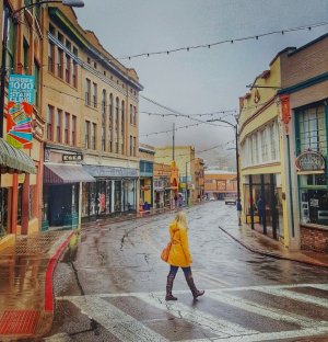
PS: Yeah, that Bisbee one's a stunner- I'd fix the background sky and make it partly cloudy 'cause blue would work better than mist-white, but it's still the buildings, curve and wet street that catches the eye.
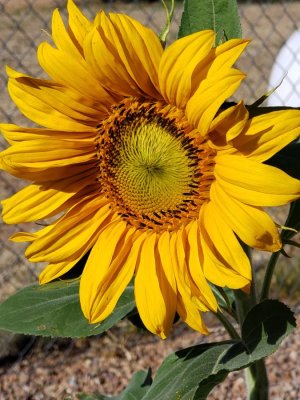
Goodness, with these lovely references I thought there would be oodles of posts by now! I am not a good flower painter, and seem to have problems with yellow (and most other colors ) so I attempted the sunflower. It is a watercolor in a W & N 140CP 5 x 7 sketchbook. My first experience with their paper and I was impressed; I will never go back to cheap sketch paper again.
Your sunflower is beautiful Joy. If I may make a suggestion, I’d like to see dark values behind and below the flower that are cast shadows in the photo. This will help push the light yellow forward and give the flower more prominence.
Terrific sunflower @Joy - you caught it perfectly. Kay's right about the shadows- use a purple-leaning hue, perhaps *carefully* dampen/wet the spots between the leaves and petals starting a bit more than halfway down the page to the bottom, and drop little dabs of hue to bleed around in those spaces. The purple will *pop* those yellows (and even the greens 'cause yellow's in green) and it will look even more 'finished'. Terrific work.
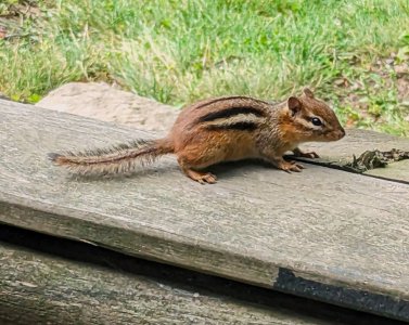
@KreativeK Your chipmunk looks as spunky and fearless as the real one was- allowed me to get about three feet from him and just waited on me to go away so he could eat his peanut. Great work!
Kay, JStarr, I was thinking of adding some background, but bored with working on the small size. It is good advice, so I may try. Do you mean darker values than the leaves or petals only?
If you use the complement of purple, it won't have to be much darker- especially if you are also dropping in nice areas of it onto wet/damp
paper to spread and feather; there'll be two contrasts: The complement contrast and the technique/appearance contrast.
But I would not go very light- I'd keep it just a smidge lighter than the leaves.
") ) so I attempted the sunflower. It is a watercolor in a W & N 140CP 5 x 7 sketchbook. My first experience with their paper and I was impressed; I will never go back to cheap sketch paper again.
) so I attempted the sunflower. It is a watercolor in a W & N 140CP 5 x 7 sketchbook. My first experience with their paper and I was impressed; I will never go back to cheap sketch paper again.