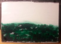
Real Time Art Practice, CS edition

5x4 inches on hardboard.
Keep trying to use up old translucent paint and it's not entirely working, especially on the face.
I want to do impasto at this scale, but I need brushes both small enough and stiff enough to stand up to the paint. Past a certain size, even synthetics are mushy.
View attachment 14752
5x4 inches, acrylic on hardboard, because I can't edit op.
 
This guy paints similar to my ideas for impasto, but naturally, he beat me to it by 8 years 😔
Hard to stay mad though. It's so fluffy...
 
Last edited:
Using up old acrylic.
5x7 ish on hardboard.
20211210_200924.jpg
 
This guy paints similar to my ideas for impasto, but naturally, he beat me to it by 8 years 😔
Hard to stay mad though. It's so fluffy...
Hmmm. Eyeing my Magimix in the kitchen and thinking if it works for meringue ........
 
  • Haha
Reactions: AES
Graphite on paper, around 5x5 inches. Done on these cheap blank page booklet things for kids, marketed as teacher's supplies. Probs not archival but whatever, it's practice.
20211212_224736.jpg
 
A series sounds like a good idea. I would be interested in seeing more of these from you.
 
  • Love
Reactions: AES
Finally getting around to posting this. Danial smith Watercolor and Windsor newton gouache on good printer paper. 8.5x11", using sumi-e brushes.
20220102_162802.jpg


The practice for the leaves.
20220102_155351.jpg
 
Last edited:
I tried to scan this, but the pencil didn't show up! Never had that happen before. Wonder if it's because the paper is cream colored? Might not be enough contrast for the scanner to see it.

Can't decide if that bottom perspective line is too steep or not. Any corrections, observations, etc are welcome, as always.

Astrobrights 8.5x11" 65 lb cardstock. Eventually gonna be acrylic.

20220104_222952.jpg
 
Purple is final correction. Gonna try painting the face in halves. Maybe having one side finished will guide me to the right proportions for the far side.
20220104_232009.jpg
 
Foreground, background, and paper sealing. Tinted matte figure, tinted gloss glazing medium bg. Even with this much color filled in, I'm starting to see where corrections should be.
20220104_235517.jpg
 
Can't decide if that bottom perspective line is too steep or not. Any corrections, observations, etc are welcome, as always.
It depends on whether you are aiming for geometrically correct perspective, or distorted perspective. If you want academically correct, traditional perspective, the lines should meet at a vanishing point. Counting from the top, lines 1. 2. and 5 are correct, but lines 3 and 4 do not belong to the same perspective as the green set, lines 1, 2, and 5.

Lines.jpg
 
Last edited:
I think the scanner didn't have enough contrast to scan it in clearly. If you notice that once you added the dark background, it looks a lot better. Maybe because that was an added contrast in the art. Just guessing. It's a great start! :)
 
It depends on whether you are aiming for geometrically correct perspective, or distorted perspective. If you want academically correct, traditional perspective, the lines should meet at a vanishing point. Counting from the top, lines 1. 2. and 5 are correct, but lines 3 and 4 do not belong to the same perspective as the green set, lines 1, 2, and 5.

View attachment 16564
Ooh thanks for this! I don't think the ref is too distorted, (a 3d model) but I tend to unconsciously "correct" it anyway when drawing it. Guess I need to pick just one view and stick with it.

20220105_112813.jpg


What software did you use to make that?
 
Last edited:
Back
Top