You are using an out of date browser. It may not display this or other websites correctly.
You should upgrade or use an alternative browser.
You should upgrade or use an alternative browser.
Real Time Art Practice, CS edition
- Thread starter AES
- Start date
Artyczar
Moderator
- Messages
- 13,675
WOW! I LOVE your style AES! 
I have a garment industry background, so this reminds me quite a bit of the style cards on the patterns we worked on when I was a kid. I worked alongside my father who was a grader (this is one who makes the sizes of a garment in manufacturing). I was a cutter (patterns, not material). There was also a lot of rubber stamping involved in this trade, so your date stamping is also very nostalgic to me.
Anyway, these are beautiful! They also remind me of the vintage pattern magazines that my family had. I probably only have a few of those left from the 1940s.
AES
hi
- Messages
- 208
WOW! I LOVE your style AES!
I have a garment industry background, so this reminds me quite a bit of the style cards on the patterns we worked on when I was a kid. I worked alongside my father who was a grader (this is one who makes the sizes of a garment in manufacturing). I was a cutter (patterns, not material). There was also a lot of rubber stamping involved in this trade, so your date stamping is also very nostalgic to me.
Anyway, these are beautiful! They also remind me of the vintage pattern magazines that my family had. I probably only have a few of those left from the 1940s.
Lol it's that obvious, huh? That’s exactly how I learned to draw: copying clothes out of catalogs and later off of sewing patterns when I was learning to sew. That and anime, but even that was mostly for the fantastical outfits I wanted to try to make one day. I still have an enormous binder full of ideas for when teenage me thought I'd be an actual fashion designer.
I love my stampThere was also a lot of rubber stamping involved in this trade, so your date stamping is also very nostalgic to me.
 I wonder if it's good enough/unique enough for a signature on the rest of my stuff, because my real name isn't coming within 1000 miles of the internet.
laika
Loitering Member
- Messages
- 1,415
8x11 inches. Watercolor on rice paper, traced from an original with carbon paper, then gone over with a sumi ink brush.
Very elegant, AES! I like the way the lines on the rice paper bled a tiny bit, giving a soft look. Good stuff!
AES
hi
- Messages
- 208
Thanks. Next time I'll try to do that on purpose lol.Very elegant, AES! I like the way the lines on the rice paper bled a tiny bit, giving a soft look. Good stuff!
Artyczar
Moderator
- Messages
- 13,675
I used to use a rubber stamp on the backs of my pieces, but it was mostly just as a logo. I used it with an ink signature. I used the stamp until I got too lazy. Now I just use a Sharpie signature on the back, or a pencil on works on paper.I love my stamp
Your initials are sorta my real name initials: A. Es

AES
hi
- Messages
- 208
Paint swatches for the challenge over in the animals and wildlife forum. I'm having g a hell of a time mixing the brightest green. I think it needs pthalo green yellow shade, but I only have that in acrylic.
Maybe nows the time to get around to that blasphemous oil mixed with acrylic experiment I've been meaning to do.
AES
hi
- Messages
- 208
View attachment 10682
Paint swatches for the challenge over in the animals and wildlife forum. I'm having g a hell of a time mixing the brightest green. I think it needs pthalo green yellow shade, but I only have that in acrylic.
Maybe nows the time to get around to that blasphemous oil mixed with acrylic experiment I've been meaning to do.
Confucius say: the art is in the "close enough."
AES
hi
- Messages
- 208
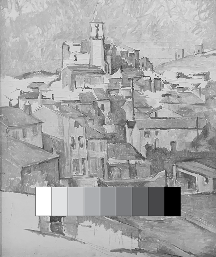
What Is Value in Art and Why Is It So Important?
Value in art is widely considered to be one of the most important elements of painting. Learn what value means, why it's so important, and how to use it effectively here.
 drawpaintacademy.com
AES
hi
- Messages
- 208
Something I've been calling "relative brightness" never fails to throw me. The color pic looks like a nice bright sunny day, the black and white looks like mud. My theory is that the human eye (or maybe just my eye?) perceives different hues as inherently brighter or darker no matter what the objective value is. Like, a yellow, even a dull ochre yellow, will always look brighter than a blue, even if the blue is actually lighter in value.
Which should theoretically make value studies obsolete since you can just use what looks brightest to you and it will still look right, but for some reason it just doesn't work like that (unless your name is Monet).
Which should theoretically make value studies obsolete since you can just use what looks brightest to you and it will still look right, but for some reason it just doesn't work like that (unless your name is Monet).
Attachments
Last edited:
AES
hi
- Messages
- 208
Illustrating the limits of black and white: every color on the strip is different, both in brightness and hue, but in the black and white version, 2 of them are identical. How do I actually apply this? Idk.
Attachments


Last edited:
Hermes2020
Well-known member
- Messages
- 1,769
You are correct, phthalo green yellow shade will be a good choice. However, your yellow looks too warm to me to give a really bright green. Are you using cadmium yellow? A warm yellow contains a bit of red. Red is the complementary of green. Complementary colours give grey when mixed, so the warm yellow will darken the green. Try using a cool yellow (usually called lemon by different manufacturers), something like Winsor Lemon. That will give you a really bright green.View attachment 10682
Paint swatches for the challenge over in the animals and wildlife forum. I'm having g a hell of a time mixing the brightest green. I think it needs pthalo green yellow shade, but I only have that in acrylic.
Maybe nows the time to get around to that blasphemous oil mixed with acrylic experiment I've been meaning to do.
AES
hi
- Messages
- 208
This prompted some more careful mixing. The swatches below are pthalo green yellow (pg36) acrylic mixed with various oil yellows and Benzomidazalone light (py175) acrylic. The cad yellow lemon (py35) does come close enough I think, although the Benzo is a little more florescent. ThanksYou are correct, phthalo green yellow shade will be a good choice. However, your yellow looks too warm to me to give a really bright green. Are you using cadmium yellow? A warm yellow contains a bit of red. Red is the complementary of green. Complementary colours give grey when mixed, so the warm yellow will darken the green. Try using a cool yellow (usually called lemon by different manufacturers), something like Winsor Lemon. That will give you a really bright green.
")
Last edited:
Similar threads
- Replies
- 15
- Views
- 614