You are using an out of date browser. It may not display this or other websites correctly.
You should upgrade or use an alternative browser.
You should upgrade or use an alternative browser.
Real Time Art Practice, CS edition
- Thread starter AES
- Start date
AES
hi
- Messages
- 208
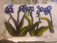
2 tiny pseudo Van Goghs, tests for the acrylic challenge on wet canvas. If you want your acrylic to layer wet in wet like oil, Golden extra heavy matte gel is it. None of the other gels are the right kind of "dry" and just bleed together.
Golden Acrylic on yupo trading cards. Left is matte medium, right is extra heavy gloss mixed with liquitex modeling paste. It works in its own way, but is no substitute for the xhvy matte.


 artsandculture.google.com
Golden Acrylic on yupo trading cards. Left is matte medium, right is extra heavy gloss mixed with liquitex modeling paste. It works in its own way, but is no substitute for the xhvy matte.
Iris - Gogh, Vincent van - Google Arts & Culture
Google Arts & Culture features content from over 2000 leading museums and archives who have partnered with the Google Cultural Institute to bring the world's treasures online.
 artsandculture.google.com
Last edited:
AES
hi
- Messages
- 208
Recipes
Pastel making:
1 oz is about two tablespoons
About 2 tablespoons of material per pastel.
Fixing pastels makes them change color because the chalk in them becomes transparent when sealed. Pure pigment ones hold their color better. Adding ti white might help too.
I can do this on the cheap if I only use found pigments.
Artyczar
Moderator
- Messages
- 13,819
Nice! 
Have you tried the Golden Open Slow-drying acrylic paints? They kind of work a little like oils in that they are very slow-drying. You can kind of do that wet-on-wet technique.

Have you tried the Golden Open Slow-drying acrylic paints? They kind of work a little like oils in that they are very slow-drying. You can kind of do that wet-on-wet technique.
AES
hi
- Messages
- 208
I do have a couple of those, but have only really used them to extend my regs. Will try.Nice!
Have you tried the Golden Open Slow-drying acrylic paints? They kind of work a little like oils in that they are very slow-drying. You can kind of do that wet-on-wet technique.
AES
hi
- Messages
- 208
Tools of the Trade: Traditional Inking
 www.makingcomics.com

Best Brushes for Painting Miniatures & Wargames Models - 2023 - FauxHammer
Choosing your First, or next brush set? Do you want the best Quality Paint Jobs or just the most cost-effective brushes? We've got you covered
 www.fauxhammer.com
Last edited:
AES
hi
- Messages
- 208
A slightly lopsided ball, more or less following this guy but in acrylic.
Around 3 inches square, acrylic and matte medium.

Around 3 inches square, acrylic and matte medium.
AES
hi
- Messages
- 208
Aicantar no. 4 or 5. Can't remember at the moment. 6x4 inch acrylic on grumbaucher student watercolor paper. A character from the game Skyrim. He's become a sort of metric of how I'm doing painting-wise. Once I am happy with a portrait of him, then I can say "I can paint".
The right one is the best one yet by far. The left, well, if I only posted the half-decent ones, then this wouldn't be real time art practice, would it

Still have to actually paint it though.
The screenshot ref, taken by me. Do screenshots count as digital photography?

The right one is the best one yet by far. The left, well, if I only posted the half-decent ones, then this wouldn't be real time art practice, would it

Still have to actually paint it though.
The screenshot ref, taken by me. Do screenshots count as digital photography?
Last edited:
AES
hi
- Messages
- 208
Yeah, Skyrim.Interesting experiments. Also, it's cool you're painting from the game. Is it Skyrim?
Hermes2020
Well-known member
- Messages
- 1,934
To my eyes, the tone curve looks a bit off in the photo, so I took the liberty of adjusting it. Does this look better? Only you can judge, because you have the original in front of you. Hope you don't mind!

AES
hi
- Messages
- 208
Yeah edit away. That goes for everyone else too. Whatever you think might help.
Yours is more saturated than the original, but in bw now shows that yellow being both lighter and brighter than the gray on the chin. Guess that means no more grayscaling on my phone because distortion. At any rate, I'm thinking it’s a problem with the drawing more than anything else. That and my continued avoidance of learning to paint/draw in grayscale. Ugh.
Yours is more saturated than the original, but in bw now shows that yellow being both lighter and brighter than the gray on the chin. Guess that means no more grayscaling on my phone because distortion. At any rate, I'm thinking it’s a problem with the drawing more than anything else. That and my continued avoidance of learning to paint/draw in grayscale. Ugh.
Last edited:
Maybenartist
Well-known member
- Messages
- 609
I like this one, its clean with the simple lines and the colour and shadow have a nice gradient.Another one of these. And I finally managed to keep it clean.
View attachment 10745Sumi ink and watercolor, on grumbacher student watercolor paper. 9x12
AES
hi
- Messages
- 208
Attempt at a green/grayscale of this big ass moth-thing I found on my car today.
Part of the problem is I didn't notice my drawing wasn't accurate until I started painting. The other problem is where do I even start on something like this, with all those different colors and textures? I have this problem when trying to draw faces too. What do I pencil/outline, and what do I leave to paint?
And of course, how the f*ck do I light and shadow? I just can't see it. Not the way all those damn tutorials want me to anyway.
Last edited:
Dm7
Well-known member
- Messages
- 143
What helps me is to think the lightest and darkest values have to be saved for later as "accent" and use the midtone/middle value to do the rest. Usually, in most situations, that work out just fine.
For example, with the moth, I see you're using pure white for the highlight when in the picture it's not pure white, more like 2nd value on the light side. That way, you can use more vibrant colors without losing it too much due to white. Also notice its legs, they are almost black, but not pure black. Establish that as your darkest value, and try to bridge the midtone between both lightest and darkest values you've chosen. Keep it simple. I hope I make sense here and hope that was somewhat helpful? I'm more than glad to try and help out some more if you want it.
Good luck!
For example, with the moth, I see you're using pure white for the highlight when in the picture it's not pure white, more like 2nd value on the light side. That way, you can use more vibrant colors without losing it too much due to white. Also notice its legs, they are almost black, but not pure black. Establish that as your darkest value, and try to bridge the midtone between both lightest and darkest values you've chosen. Keep it simple.
 I hope I make sense here and hope that was somewhat helpful? I'm more than glad to try and help out some more if you want it.
Good luck!
Similar threads
- Replies
- 23
- Views
- 556


