JStarr
Well-known member
- Messages
- 724
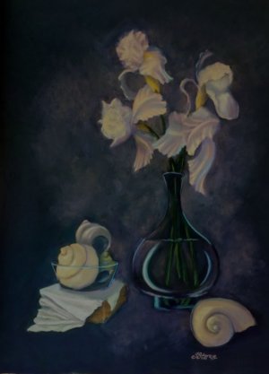
Okay, well, I've been working on this for awhile but was never happy because I couldn't get the blooms shadowed appropriately against that very, very dark bkg- in order to make them melt into that bkg, I had to darken them to the point they were no longer white, not to mention, most such shadows have a blue tint and I really tire of blue shadows.
So, I ended up going expressionist, which finally worked on the background and blooms, so I kept it going into the vase, especially and a bit into the seashells. Pastels work really well for expressionism: If the value is right, the colour doesn't matter.
So, there's pink, yellow, lavender and turquoise white iris.
Neither black, gray or white used- the darkest darks are sticks of very dark green/blue/purple layered over and over each other; the lights are light yellows and pinks, mostly, with a few turquoises. The lightest white slash on the cloth is actually a very light turquoise-ish stick- against the faintly grayed-yellow and purple-y shadows and such, its cool light looks white.
Cell phone pic somewhat adjusted in Paintshop, although after reading up on the Pixel camera, I discovered even RAW gets compressed somewhat- which doesn't thrill me. But, it's as done as it is going to be (except I will drop a shadow on the middle right bits of the front right shell- it needs more foreshortening there).
")


