Shading practice - Tips welcome

Bytebatt

Active member
Messages
11
As of late I’ve been trying to improve my shading skills.
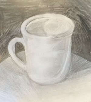
For a task in my art class at school we had to recreate an image of a cup via a black in white medium. I tried my best to replicate each detail as close as I could.
I love how this piece came out and would be interested to see what people think about it here, any tips or criticism are more than welcome
 

Attachments

  • IMG_5253.jpeg
    IMG_5253.jpeg
    105 KB · Views: 47
Shading is very good on this. Just shade where you see shading on your subject and you can't go wrong. You might deepen the contrast a bit, like down inside the cup toward the bottom to give it a more dimensional appearance.
 
Yeah, agree stretch the value range. Darker darks and lighter lights. It always helps me to feel like I am exaggerating that aspect...

A principle that ´s connected to this is the lightest dark (on the shadow side of an object) is darker than the darkest light (on the light side of an object).
I hope this makes sense, it sounds confusing to me reading that back...:unsure:
Your brain tricks you into seeing these values "wrong", This optical illusion demonstrates this well, https://en.wikipedia.org/wiki/Checker_shadow_illusion

I also think shading with strokes in the same direction would improve this.
 
I think this is a great drawing. I agree with sno if you wanted to improve upon it. Keep up the great work! :)
 
Yeah, agree stretch the value range. Darker darks and lighter lights. It always helps me to feel like I am exaggerating that aspect...

A principle that ´s connected to this is the lightest dark (on the shadow side of an object) is darker than the darkest light (on the light side of an object).
I hope this makes sense, it sounds confusing to me reading that back...:unsure:
Your brain tricks you into seeing these values "wrong", This optical illusion demonstrates this well, https://en.wikipedia.org/wiki/Checker_shadow_illusion

I also think shading with strokes in the same direction would improve this.
Thank you very much for the advice!
I remember reading about this effect before a few years ago but I never knew it was that drastic, thank you very much for reminding me of it ^^
 
Shading is very good on this. Just shade where you see shading on your subject and you can't go wrong. You might deepen the contrast a bit, like down inside the cup toward the bottom to give it a more dimensional appearance.
Thank you very much for saying so, I’ll try increasing my use of contrast in future :)
 
Back
Top