You are using an out of date browser. It may not display this or other websites correctly.
You should upgrade or use an alternative browser.
You should upgrade or use an alternative browser.
Triptyque
- Thread starter Desforges
- Start date
Hermes2020
Well-known member
- Messages
- 1,407
I like them as individual paintings, but I took the liberty of trying them as a triptych and I think they work together well.


Desforges
Well-known member
- Messages
- 1,295
Thank you, Hermes! I was trying to attach them but I can only work with my phone and didn’t know how. On the floor , they really fit together. I have started to use metallic colours and got a little too excited about it.I like them as individual paintings, but I took the liberty of trying them as a triptych and I think they work together well.
View attachment 22529

Thank you all for the comments. At times, I doubt myself ( most of the time). I appreciate the response.
My spelling is in French. Tych ! Got it.
Last edited:
")
Jo Castillo
Supporting Member
- Messages
- 3,653
I like all three alone or together. Very strong successful pieces. Love the colors. Why do we doubt ourselves? Hmmm.
Hermes2020
Well-known member
- Messages
- 1,407
"Doubt" is my middle name when I am making art stuff.I like all three alone or together. Very strong successful pieces. Love the colors. Why do we doubt ourselves? Hmmm.
Desforges
Well-known member
- Messages
- 1,295
I was going to place the one with the sig on the left and the green one in the middle. I could also cover it. Thank you for mentioning. What do you think?They are gorgeousI agree with everyone here, strong together or apart the only thing that draws my eye a bit too much is your sig on the bottom left of the middle one

Hermes2020
Well-known member
- Messages
- 1,407
I tried that at first, but thought they balanced better with the signed one in the middle. Here are the two possibilities with it on the left. To my eye the results are less successful (less cohesive.) As the artist, it is ultimately your call—I am just showing the possibilities.I was going to place the one with the sig on the left and the green one in the middle. I could also cover it. Thank you for mentioning. What do you think?

Desforges
Well-known member
- Messages
- 1,295
I just removed the sig and nearly messed it up.
Autocorrect kept changing the word sig
to dog .
.
I am exhausted.
If someone ever buys them, they can do anything they want.
Thank you so much for playing with me.
Also, I can’t get the right filter to adjust the colours to what they really are.
So far, Hermes is the winner.
From now on, it is public property.
Thank you ALL for the encouraging words.


Autocorrect kept changing the word sig
to dog
.I am exhausted.
If someone ever buys them, they can do anything they want.
Thank you so much for playing with me.
Also, I can’t get the right filter to adjust the colours to what they really are.
So far, Hermes is the winner.
From now on, it is public property.
Thank you ALL for the encouraging words.
Last edited:
Hermes2020
Well-known member
- Messages
- 1,407
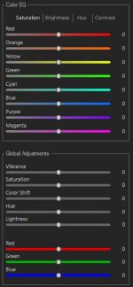
That issue has bugged me for a long time. Photos straight out of the camera rarely look right. After taking a photo of a painting in Nikon NEF format, which is their RAW format, I use ACDSee Photo Studio (a legal copy!) to develop it to get the best colour balance, at the same time looking at the painting to get things right. This is the tool in ACDSee....
Also, I can’t get the right filter to adjust the colours to what they really are.
...
As an aside: I used to use Adobe Lightroom, but switched to ACDSee because it has a file explorer, unlike Lightroom. Lightroom requires you to import photos into a database first. For my needs, ACDSee can do everything Lightroom does.
I always include a pure white card next to the painting as a reference when I adjust the white balance. I have been looking for a free, universally available card with colour swatches we could all use to make sure our colours are accurate. It could also be used to calibrate our monitors to give the best colours. I would love to hear whether anyone has suggestions for this.
Attachments

Dave Woody
Well-known member
- Messages
- 2,201
Beautiful works
Similar threads
- Replies
- 5
- Views
- 172
- Replies
- 27
- Views
- 621