Shift Changer

Enyaw

namuh
Messages
7,024
13.jpg

Wayne Gaudon .. Alla Prima .. Oil On Paper .. 11 x 14 inches ...
 
That's a lot of green! I'm having a little bit of a hard time figuring out the window/frame part.
 
Thank you.
That's the hook that is supposed to make you linger a little longer. What is that. Oh shit, it's nothing.
 
Looks like a canvas propped on the chair in which you've done a close-up study of the bottle. Wait, I see the profile of a person looking to the left in your study and is that an angel's wing? If so then it appears the angel is holding a goblet out toward the bottle as if requesting a refill. Good story, Wayne!
 
There definately is a character looking left and that is the shift changer about to change again. Tell Ayin the frame is there because the artist was drunk and put his still life on the wrong side of the canvas.
Oh my.
The talk!
Should be interesting tomorrow when I show you the book I took from the shapeshifter who in mythology, folklore and speculative fiction has the ability to physically transform oneself through an inherently superhuman ability, divine intervention, demonic manipulation, sorcery, spells or having inherited the ability.
 
The window frame just fell off the wall. The painting is about that gorgeous green painted canvas sitting on the chair. May be some connection between the painting and the wine bottle label. :giggle:❤️
 
Thanks Sno.
This is the truth. I have been using black as my mother color and then to finalize I don't use the mother color in the final brush/knife overs. It really pushes the light. As old William Alexander used to babble, "don't be afraid of the dark, you need dark to make light".
 
There definately is a character looking left and that is the shift changer about to change again.
Oh good. I thought maybe I was seeing things that weren't there. (It wouldn't be the first time!) Great tip about using black!
 
Thanks Donna.
When you look, you see. Glances don't do a thing. I used a lot of colours for mother but I found black an excellent choice as it doesn't change hue as easily as others as well as it can get you down and dark and darker but the darks are not black or out of place. Example. You can have a red black, a blue black, a green black and more. Opens doors.
 
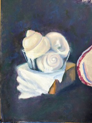
Jackie Simmonds always said "If white is not light enough, you need more darks."

It was one of her best pieces of advice.

I prefer using other darks to create a complex dark passage. I am currently working with very dark: olive-y green, purple-blue and wine red; these create a dark that really works- and also allows me to echo those same hues in lighter passages for a cohesive colour scheme.

But I work in layers and layers of colour in soft pastels, not in a one-layer, direct application of oil paint, so mileage *must* vary.


(I cannot imagine not having the Get Out of a Mistake Card by only using direct application- I'd have to switch to, like, charcoal; it's something I admire in those who use that process- so well done you, Wayne! To me, getting what I want is like cooking: You keep adding and balancing and heating until you have the flavor you want. At first, lots of mistakes, but as you learn how colour works in soft pastel [which are pure pigment made into a paste (pastel) and rolled or pressed into stick form] it becomes far easier to get what you want, hue and value-wise).
 

Attachments

  • whiteirisdetail01.jpg
    whiteirisdetail01.jpg
    110.6 KB · Views: 24
Agree. I don't need black as I can get black from Sienna and Prussian blue, or Indian yellow and crimson, Rose, ultra marine blue. There are other combinations. I just like its behaviour. Black and Indian yellow create a nice olive which you can turn to greenish with blue or leave it toward yellow.

Nice color above.
 
Back
Top