Cyanotype

NedL

Supporting Member
Messages
254
Hi All,

I'm Ned and I'm here at CreativeSpark mostly because I am learning to sketch and the folks here in the "scavenger hunt from life" are so friendly and wonderful, they make it really fun.

I'm also a photographer, mostly practicing very old-fashioned kinds of photography, and I also enjoy making prints of various kinds. I recognize Terri from the photrio forum. I was thinking of posting some of the prints I'm making here... and was thinking of posting all of them ( good, bad, indifferent ) as they happen, basically showing progress and what I'm doing. Successes and Failures!

Not sure if people here want to see this kind of thing, or if you'd rather just see the "best"? Is it better to make a new thread for each print, or is it OK to put them all here in this thread??

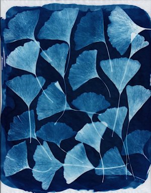
This is the first one, printed a couple weeks ago. It could end up being one of the best, because of course I picked an image I liked and thought would print well to try first. It's a cyanotype made from an inkjet digital negative. We went to the aquarium in Monterey, California about a month ago and I have a series of photos I thought I'd make cyanotypes from. Should I post the whole series here in this thread? ( there is one more I haven't scanned yet, and I'm printing the 3rd this afternoon! Probably will be 10 or 12 in all. )

mbaycyan0001.jpg
 
You choose, we enjoy.

However, please explain what a cyanotype is- and what makes it different than point, shoot, [develop] print- enquiring minds, and all.

I like the two jellyfish- not sure about the photography part, but the composition is decent, and there's enough extraneous jellyfish parts to not allow the eye to ping-pong between two like shapes.

So, please choose- we'll enjoy.
 
Hi Jstarr,

Thanks! I'll keep posting them and we'll see!

Cyanotypes in a nutshell:

Cyanotype is one of the forms of printing that was discovered by the scientist John Hershel in the early 1840’s. It produces a negative image of white on a blue background. Probably the most famous cyanotypist was Anna Atkins, who made beautiful botanical photograms of seaweeds using this process and printed a book which is probably the first book ever published containing photographic images. For many years, architectural blueprints were made with cycanotype, being replaced about 100 years later by a diazo process which produces a positive image ( blue on a white background ). It has been used on and off over the years to make photographic prints, postcards, etc. In the early 20th century, it was a popular way to produce proofs, before the effort of making a silver print. Some art stores sell prepared cycanotype paper as “sun print” paper (aimed at kids). A few years ago the British chemist Mike Ware developed a “new” formula that has several advantages, and he wrote the most complete reference about the process that I know of: cyanomicon. You can probably learn almost anything you want to know about the process by downloading and reading that.

For me, compared to other kinds of photography I am interested in, it is relatively simple and quick, quite non-toxic, and doesn’t involve managing or disposing of any hazardous compounds. The prints are “developed” by washing in plain water, which removes the yellowish unexposed areas and leaves the prussian blue areas behind. Until now I have only played around with it making photograms, mostly of leaves. I’ve attached a few of those here. These are made by putting the leaves directly onto the cyanotype paper, placing a piece of glass over it, and then setting out in the sun for a couple hours to expose. It’s delightful to open it up and discover what the print looks like. The positive image of the bay leaves was made by making a photogram on black and white photographic paper ( then develop and fix ) and then using that as the negative to make the cyanotype print. All of my prints use approximately the original formula that John Hershel used. I think of the process as something fun and pleasing to do, but I have not seriously attempted to refine it or make perfect prints. There are some photographers who put in more effort and make beautiful cyanotypes, but I'm aiming more to have fun and hopefully produce some pleasing prints along the way.

I thought it would be fun to try to make some prints from digital camera images, and those jellyfish were my first try at that. The original photograph was made with an inexpensive cannon point-n-shoot “elph” digital camera. The the image was desaturated, curves tweaked to fit the process, inverted, colorized green ( the green ink in my inkjet printer blocks UV light pretty well ) and printed on thin inkjet photopaper. I used that as the negative, and exposed the cyanotype in the sun for 2 or 3 hours.

Happy to try to answer anything, but I’m definitely not an expert, just like to play with the process!

Cheers!

Ned
 

Attachments

  • cyanginkgo.jpg
    cyanginkgo.jpg
    144.2 KB · Views: 32
  • cyanbay.jpg
    cyanbay.jpg
    110.5 KB · Views: 29
  • callas.jpg
    callas.jpg
    139.5 KB · Views: 28
  • liquidambar.jpg
    liquidambar.jpg
    147.7 KB · Views: 31
Last edited:
I made a 3rd print yesterday. After washing the print, I let it dry on a plate of glass overnight, and then press it between books to flatten. That one won't be ready to scan for a day or two. Meanwhile, here's the 2nd one from about a week ago. The sand crabs are cute but I don't like this one as much as the jellyfish. I don't think it works as well in blue. ( the sand crabs in real life were grey, on white sand, in blue water! )

The image area in these prints is about 7.5 x 9.5 inches. The leaf prints in the previous post all all bigger, mostly 9 x 12 inches.

2nd "digital negative" cyanotype. Sand Crabs at the Monterey Bay Aquarium
mbaycyan0002.jpg


PS. Just stuck the 4th one out in the sun. I'm having enough fun printing these that I wish I'd brought my better Z5 digital camera to the aquarium. Without a flash, and with everything moving in the water, it was difficult to not to get motion blur with the long exposures the tiny "digial elph" camera needed. I'm thinking of a visit to the Steinhart aquarium in San Francisco, this time not so much as a tourist visit, but to get better compositions of jellyfish with a better camera :)
 
Last edited:
Ned, these are all gorgeous. I can see your mindful patience in each and they all have a kind of zen to them. They are beautiful and they all have a signature to them.

Feel free to post as many as you want, or make a thread for each. That is up to you. Terri may have an opinion as well. I consider her the czar of this category since I'm not a true photographer. I am only a deep admirer or the craft, and your work so far is beautiful! ♥️
 
Hi Ned! I must admit I don't go to Photrio much these days, so it's flattering that you recognize my name from over there. :) I chatted mostly with the bromoil group (RIP, Gene Laughter!), and likely Polaroid - any other alternative process folks. (That's my jam, though I confess I've not done much new work recently. Losing Polaroid, HIE and certain enlargement papers for bromoil has taken some of the wind from my sails.)

Your cyanotypes are among the best I've ever seen! It's a process I've not tried (mainly for the "sun print" process itself), but you're certainly showing how lively and fun they are. Each of your leaves are beautifully done, too, as well as the sand crabs. Terrific variety!

Arty called me the photography/film category czar! 🥳 Maybe someday I'll be as special as they are but it's unlikely. ❤️ But joking aside, if you want to keep adding to this thread for your cyanotypes, that's fine. You can open new threads, too, if there's an extra process to mention, or you want to keep the digital negs separate from the real ones - or any other criteria that strikes your fancy. We're easy around here.

I keep thinking I should have Mike Ware's book around just because it gets mentioned so often, it's probably a useful addition. He's the chemist, right?
 
Hi Ned, and welcome to the forum. These prints are all amazing. I love the jellyfish and the leaves are every one gorgeous. Keep em coming. ❤️
 
Hi Ned! I must admit I don't go to Photrio much these days, so it's flattering that you recognize my name from over there. :) I chatted mostly with the bromoil group (RIP, Gene Laughter!)......

Hi Terri,

Thanks! I'll keep putting them here!

Gene Laughter opened my eyes to how amazing art could be made starting with photography. I love what he made. He was a little before my time but I read many of his comments at APUG and he was very kind and generous. For anyone reading this who is interested, this is worth a visit and taking some time to look through:

Gene Laughter gallery

I did a lot of work trying to develop a method of making oil prints not using chromates. Oil prints are inked like bromoil, but starting with a full size negative contact printed to make the gelatin matrix, no photopaper involved. I wrote a blog about my progress on APUG but it didn't transfer to the new Photrio site. I managed to make some recognizable images, but there was still a long way to go to make nice prints. Someday I hope to get back to that!

Mike Ware is the chemist. I put a link to a pdf of his cyanotype book "cyanomicon" above, if you want to look at it. But really, it's more fun just to mix 8% pot ferri with 20% AFC ( or 10% pot ferri + 25% AFC ) in equal parts, brush it on some paper, let it dry, then see what happens!
 
Last edited:
Hello Ned, thank you for your fascinating introduction to the process. I have downloaded Mike Ware's book, but haven't had time to study it in depth. In your last post you mention mixing potassium ferricyanide with AFC. Could you please explain what AFC is, as I don't see it mentioned in the PDF?
 
Hello Ned, thank you for your fascinating introduction to the process. I have downloaded Mike Ware's book, but haven't had time to study it in depth. In your last post you mention mixing potassium ferricyanide with AFC. Could you please explain what AFC is, as I don't see it mentioned in the PDF?
:) Sorry for using that lingo! ammonium ferric citrate (AFC) is also called ferric ammonium citrate (FAC). It is not a very well-defined formula, it is usually green but sometimes brown. It might also be called ammonium iron(III) citrate, or iron(III) ammonium citrate! You get the idea!
 
:) Sorry for using that lingo! ammonium ferric citrate (AFC) is also called ferric ammonium citrate (FAC). It is not a very well-defined formula, it is usually green but sometimes brown. It might also be called ammonium iron(III) citrate, or iron(III) ammonium citrate! You get the idea!

Thank you, I get it. I just wanted to be sure!
 
This thread is going to go for several months, at least! There might not be a new entry for a while, since I'll be going on vacation in a few days. I'm not going to call it a "failure" because it's like a "proof"... it makes me think this one might be worth another try. You can see the highlights got blown out, and I need to make a new negative and try again. Cyanotypes are very inexpensive to make, so it just costs a little time to try again several times ( and it's fun to see the results each time anyway ).

3rd "digital negative" cyanotype. Sea Anemones at Monterey Bay Aquarium.
mbaycyan0003a.jpg


This was the desaturated image. I need to make another with better highlights.
IMG_1508a.jpg
 
Ned, beautiful images and prints. Wow, way to complicated for me. I will share with my photographer son. I'm always happy to learn if I don't have to study.
 
This thread is going to go for several months, at least! There might not be a new entry for a while, since I'll be going on vacation in a few days. I'm not going to call it a "failure" because it's like a "proof"... it makes me think this one might be worth another try. You can see the highlights got blown out, and I need to make a new negative and try again. Cyanotypes are very inexpensive to make, so it just costs a little time to try again several times ( and it's fun to see the results each time anyway ).

3rd "digital negative" cyanotype. Sea Anemones at Monterey Bay Aquarium.
View attachment 32364

This was the desaturated image. I need to make another with better highlights.
View attachment 32365
Interesting how even a little bit of a blown highlight gets so out of control on the cyanotype. Are those actually blown areas on your digital negative, or could you get some detail if you pulled back the highlights/exposure?

I loved seeing the link to Gene's page. ❤️ He always preached to go "one stop over. one grade under" with film negatives before starting the process. Not exactly a flat darkroom print, but all the highlights were certainly toned down - blown highlights are as big a problem when inking a matrix as they appear to be with cyanotypes! I wonder if you could loosely follow those same guidelines for your digital process.
 
I wish I could do this. Again, beautiful! ♥️
:) I'm 100% sure you could do it, it's not as complicated as it seems and you don't need any special equipment. Well, a scale that can measure 10th of grams is helpful, $8 at Amazon. The leaf prints were made on a clipboard, with a piece of glass from a dollar store frame, and a few bulldog clips. When I get back from vacation in September, I'll try to write up some simple instructions and you'll see there's not that much to it :)
 
Interesting how even a little bit of a blown highlight gets so out of control on the cyanotype. Are those actually blown areas on your digital negative, or could you get some detail if you pulled back the highlights/exposure?
You asked the same question I asked myself! Yesterday I looked at the digital image again and the highlights are not blown. I should be able to make a negative that will print better. Cyanotypes are odd that way, there is a very limited range of ink density on the negative that produces variation, and as far as I can tell you can't really "print through" by making the exposure in the sun longer. I'm new at this so I don't have the adjustment curve figured out yet.

Blown highlights in bromoil would be areas where the gelatin didn't harden enough. I had the same problem when I was working on oil prints! Definitely an art to getting it right! But I think you are right, it's the same general problem of matching different scales.
 
Have you tried burning in the highlights by masking the darker areas with bits of paper? That's what we used to do in the old days when printing in the darkroom.
 
:) I'm 100% sure you could do it, it's not as complicated as it seems and you don't need any special equipment. Well, a scale that can measure 10th of grams is helpful, $8 at Amazon. The leaf prints were made on a clipboard, with a piece of glass from a dollar store frame, and a few bulldog clips. When I get back from vacation in September, I'll try to write up some simple instructions and you'll see there's not that much to it :)
Thank you. I would like to play!
 
Have you tried burning in the highlights by masking the darker areas with bits of paper? That's what we used to do in the old days when printing in the darkroom.
I haven't tried that with cyanotype. In this case, the simplest and quickest thing to try is to print a new inkjet digital negative. But I am curious if that kind of dodging/burning could add some flexibility to the printing.

We're heading out on vacation tomorrow, ..... to be continued... :)
 
Back
Top