RenatoNF
Active member
- Messages
- 31
Hello my fellow painters!
I've wanted to make this experiment for a while, and I finally could today.
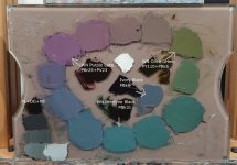
This experiment was to see what would be the result of using 3 near black and low chrome colors in place of traditional carbon/iron blacks. The reasoning behind this is convenience and slow drying properties, which I prefer. But first, the picture, and then the explanation behind it.
The colors (all Winsor & Newton):
-Purple Lake PBr25 + PV23 (Series 1, 37 ml tube)
-Olive Green PY110 + PBk6 (Series 2, 37 or 200 ml tubes)
-Perelyne Black PBk31 (Series 1, 37 ml tube)

Covenience comes from the fact that you can darken just about any color without losing too much chroma and maintaning its hue. The typical example would be to darken yellow. Its kind hard to darken Yellow unless you use some pigment like PBr7, PR101 (which are fast drying), or some combination of Transparent reds and yellows + Black. This takes time, patience, and you will probably overshoot and waste paint (if you are like me, hehe). And if you want to darken a random mixture, say a mid value purple-red-grayish color, the Umbers will not help you there because it will change the hue, a lot. Another reason is because, typically, traditional blacks tend to grey out mixtures to the extreme. And that's why I've chosen to make this experiment, to see how these 3 paints would mix with each other. I can say i'm very happy with the results!
The experiment is simple: the arrows point to the pure colors + titanium white. And between the pure tints are the mixtures between each other. So, for example, in the bottom right corner is the green mixture the came from Perelyne Black + Olive Green + White, in 3 different proportions. The same for the others. I tried to maintain the same value for all tint mixtures.
On the bottom left corner its a mixture of all 3 colors + titanium white, and i've done my best to eye ball a neutral color. It's hard because there is always the issue of white balance of the lights in my studio, the white balance of the camera that took the picture and finally the white balance on your monitor, so take this "neutral" with a grain of salt. But it is possible to get a dead center neutral with this trio.
Oh, and regarding the fact that there are 2 colors here that are not single pigments, my awnser is, yes!, and that's fine. I agree that overal its better to avoid having mixture colors. But with "blacks" or "neutrals" or "earths", its totally fine. We are intentionally looking for less chromatic colors. You just have to know how they behave and also have other single pigment primary colors on the palette to complete the package.
And finally, for references purposes, in the middle, I've put some pure Titanium White and also Ivory Black PBk9 with its tint. PS: Notice how similar the color of the Ivory Black tint is to the "bluish" side of this color wheel. Ivory Black tints are not neutral at all, it has a lot of blue in it.
Hope this was helpful!
I've wanted to make this experiment for a while, and I finally could today.
This experiment was to see what would be the result of using 3 near black and low chrome colors in place of traditional carbon/iron blacks. The reasoning behind this is convenience and slow drying properties, which I prefer. But first, the picture, and then the explanation behind it.
The colors (all Winsor & Newton):
-Purple Lake PBr25 + PV23 (Series 1, 37 ml tube)
-Olive Green PY110 + PBk6 (Series 2, 37 or 200 ml tubes)
-Perelyne Black PBk31 (Series 1, 37 ml tube)
Covenience comes from the fact that you can darken just about any color without losing too much chroma and maintaning its hue. The typical example would be to darken yellow. Its kind hard to darken Yellow unless you use some pigment like PBr7, PR101 (which are fast drying), or some combination of Transparent reds and yellows + Black. This takes time, patience, and you will probably overshoot and waste paint (if you are like me, hehe). And if you want to darken a random mixture, say a mid value purple-red-grayish color, the Umbers will not help you there because it will change the hue, a lot. Another reason is because, typically, traditional blacks tend to grey out mixtures to the extreme. And that's why I've chosen to make this experiment, to see how these 3 paints would mix with each other. I can say i'm very happy with the results!
The experiment is simple: the arrows point to the pure colors + titanium white. And between the pure tints are the mixtures between each other. So, for example, in the bottom right corner is the green mixture the came from Perelyne Black + Olive Green + White, in 3 different proportions. The same for the others. I tried to maintain the same value for all tint mixtures.
On the bottom left corner its a mixture of all 3 colors + titanium white, and i've done my best to eye ball a neutral color. It's hard because there is always the issue of white balance of the lights in my studio, the white balance of the camera that took the picture and finally the white balance on your monitor, so take this "neutral" with a grain of salt. But it is possible to get a dead center neutral with this trio.
Oh, and regarding the fact that there are 2 colors here that are not single pigments, my awnser is, yes!, and that's fine. I agree that overal its better to avoid having mixture colors. But with "blacks" or "neutrals" or "earths", its totally fine. We are intentionally looking for less chromatic colors. You just have to know how they behave and also have other single pigment primary colors on the palette to complete the package.
And finally, for references purposes, in the middle, I've put some pure Titanium White and also Ivory Black PBk9 with its tint. PS: Notice how similar the color of the Ivory Black tint is to the "bluish" side of this color wheel. Ivory Black tints are not neutral at all, it has a lot of blue in it.
Hope this was helpful!
Attachments
Last edited:
")