New Painting, Same Problem: Background.

Here's what I mean, courtesy of Photoshop...

View attachment 33594
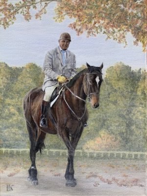
Your friend will be looking at his image and the horse, and not much else. That really is fine painting.
(Slightly better photo of the final.) Thank you for your help.
 

Attachments

  • IMG_5845.jpeg
    IMG_5845.jpeg
    221.8 KB · Views: 40
This is a great painting! The minor adjustments have made it even better. Well done!
Thank you for your help. The suggested changes
Lovely painting. My first thought was that it is incomplete. The background trees are okay because the viewer is somewhat low to the ground looking up. This also makes sence in seeing the leaves behind the rider's head. What could bring the foreground tree farther back a bit would be to have the horse and rider's shadow to the foreground and the tree's shadow farther back.
View attachment 33511
Thank you! I only just now realized the magnificent shadow you added- Amazing!
 
This is beautifully painted! the figure and horse are so convincing!
At first look the leaves seem to be competing with the figure. My guide is to always make the figure the star and every other element must support the star for a good composition. So the choice would be to either soften the leaves and even change the overall shape of that arch- maybe make it go a bit further across the top?
If you wanted to be really radical (might not work for your timeframe) I would lower the line of background trees - even to below the horse's rump- to make the figure the hero. At the moment the level of the trees is a straight line that competes with the horse's head.
All the very best with what you decide.
How can I make the figure the star of my painting without the background competing for attention?
I would be very happy if you could let me know, thanks 👍
 
How can I make the figure the star of my painting without the background competing for attention?
I would be very happy if you could let me know, thanks 👍
An idea is to make the background more distant to the back, smaller due to the perspective, and slightly less vibrant as color intensity/saturation than the subject. Not too much, not to make it obvious that you did it purposely. What the experts think about?

I find the final version very good.
 
Back
Top