I Don't HATE it, But I Don't Like it--

JStarr

Well-known member
Messages
724
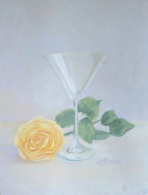
So I set this ref up YEARS ago- have a whole lot of paintings featuring that martini glass and: a stiletto high heel, or a lily or hot peppers or a fig leaf- lots of comps. I kept this one, but I don't know why- compared to the others, it was so static- no push/pull of, well, anything.

So, decided to give 'er a go, and this is the result- I am not pleased with it, mainly because I now remember why I don't like yellow objects in my set-ups: You cannot darken yellow- shadow it- in pastels without going to orange or dirt, the latter being what water colorists call "mud".

It was a week of going in and looking at it and saying "Well *pooh*" (*"pooh" might not have been the exact word used)

But, finished it today without looking at that dang yellow rose, and I like all of it except that rose, even the wonky glass bottom (it was too close to the rose- I could *see* it) but it's quite fine UArt paper and will probably not be good for anything else even if given a severe brushing. It may be destined for the big bin in the sky.

Pooh.

Luckily I have some tulips to mess with next. And if I do this again, I'll sub in an iris or lilac sprig.
 

Attachments

  • yellowmartini01.jpg
    yellowmartini01.jpg
    53.7 KB · Views: 60
You did a great job.
I like the yellow rose head, even front on as it is.
I don't see anything wrong with going to the finer deeper parts of the petals with a bit of orange/dirt shadow.
 
Well I like it! ❤️ So it is immaterial whether you do or not:LOL:. After looking at a yellow rose in photoshop and using the color picker to see the colors isolated from the others, I would be tempted to try a very light layer in the shadows of Burnt Sienna. Surprisingly, that is what the color picker showed for the shadows, almost straight BS.
 
Last edited:
You did a great job.
I like the yellow rose head, even front on as it is.
I don't see anything wrong with going to the finer deeper parts of the petals with a bit of orange/dirt shadow.
Yeah, well, I like to layer hues to achieve a more... complex passage, although I may have to go with dirt. We'll see. Maybe.

I'm considering it which is more than yellow items deserve. ;)
 
Yeah, well, I like to layer hues to achieve a more... complex passage, although I may have to go with dirt. We'll see. Maybe.

I'm considering it which is more than yellow items deserve. ;)
What would happen if you first drew over your photo image with a digital app, such as Windows Paint, to see how 'dirt' or 'orange' would look.
 
I used to do that when I had Windows Paint which I haven't had for Lo! These many years. Likely close to twenty years.

I was pretty good at it, too- I learned on Corel, so W-Paint was like child's play.

Honestly, If I had invested more... desire into this one, I'd maybe sweat it, but I didn't, so I won't.

I have some others in line....
 
Mmmm, I like this. I’m not a fan of yellow in painting anything so sympathize with you. A reddish lavender should work “in theory” to make the shadows. It is beautiful as it is.
 
Thank you all- I did go in last evening with a proper-valued greyed magenta and deepen the yellow petal interiors in a judicious manner, it worked some, but then, looking at it this morning, after letting my mind work the problem overnight, I realized something. It *is* the flower that's the problem- because it is that glass which should be the star (it is stunning when not all pixel-riddled by a cell phone's camera- even a good one) and that damned flower- of any colour or type- doesn't fit.

It's like a stunning vista of cliffs and clouds and distance and beauty- and then sticking a person walking a dog right in the fore. Doesn't work- the eye ping-pongs. The flower should be secondary, not competing for subject blue ribbon.

Part of THAT is placement, so if I ever do this again, I have already written a note on the ref: Flip ref the other way, flower to right.
 
I like it but understand that sometimes one painting turns out to be practice for another version. Dark yellows are so difficult for me and I avoid the color when I can (chicken !) I wonder how a few very subtle hints of yellow would work on the glass - maybe tie the two together?
 
It's not bothering me a bit! The glass is lovely and so is your yellow rose. But - that means little if all you're thinking is "pooh" (or worse!) every time you look at it. Your delicate background is delightful, as well.

I do agree that having the flower on the right side might be stronger, but that's a compositional issue, not one of the pallet.

Still, it's just annoying when we don't like what we've done. I can sympathize with you on that! ;)
 
Believe it or not, Donna, there's a great deal of yellow in the glass- and that lovely splashy streak up the bowl of it is all light yellow. Same as the lightest parts on the flower. It's okay- I don't like a lot of stuff I've done. Sometimes, time away from it and I change my mind, and sometimes, well, time away allows me to let it go.

Yes, Terri, the palette/background is sublime- but in person, my eye goes right to that dang (I typed dang, right?) flower.

pooh
 
Believe it or not, Donna, there's a great deal of yellow in the glass- and that lovely splashy streak up the bowl of it is all light yellow. Same as the lightest parts on the flower. It's okay- I don't like a lot of stuff I've done. Sometimes, time away from it and I change my mind, and sometimes, well, time away allows me to let it go.
Now that I'm looking at it on a different screen I can see the yellow in the glass. It's frustrating but sometimes those subtle light values get lost, at least with pastels. My main gripe is when I paint subtle sky colors and they all look a generic "light" when I post a painting online. :rolleyes: If only we could all see each other's work in person!
 
..interesting how we all see differently. To me, the painting is high value and so my eye goes to the only dark value which is the leaves
I know what you mean- it happens a lot with high value works doesn't it? To me, in person, especially, the leaves are so greyed with a dull lavender, they are noted but not an eye-catcher.

Contrast is achieved in *so* many ways....

Oughta do a lesson on it
 
Now that I'm looking at it on a different screen I can see the yellow in the glass. It's frustrating but sometimes those subtle light values get lost, at least with pastels. My main gripe is when I paint subtle sky colors and they all look a generic "light" when I post a painting online. :rolleyes: If only we could all see each other's work in person!
I used a decent entry-level SLR digital until we moved from north-NorthNORTH to southSouthSOUTH; the camera got here, but it refused all entreaties to take a photo. I think it must hate Arizona.

But I've always had a decent cell phone (starting with the original Note!) and currently have a Pixel 7 which is supposed to have a top notch camera but, to me, it has the same drawback of pretty much every digital (even DH's Nikon plus lenses) They *suck* at colour gradations- all reds are RED! all blues BLUE! all yellows YELLOW! which is anathema to taking photos of colored art. It's as if they have to keep chroma high in order to please their consumers- which, as a contrarian- doesn't please me, at all.

The background of this piece is light lavender, peach and a greyed green- all very light.

The fore is the same but a bit of blue added in spots to create depth and to delineate back from fore.

A digital camera- especially a cell- cannot differentiate on that level; so it mostly just looks "gray"- some places slightly darker or lighter than others, but mostly just "gray". I wanted it to be a neutral, and it surely is, albeit somewhat warm; but it is not gray- it is very complex, in person.

That, too, is a pooh. ;)
 
I know what you mean- it happens a lot with high value works doesn't it? To me, in person, especially, the leaves are so greyed with a dull lavender, they are noted but not an eye-catcher.
I guess I see value before I see color. :) Must be a hangover from trying to learn value.
 
I see the value of hues and passages; it is value which provides shape- no matter outlines, or brushwork or hue change- if the value is wrong, the passage is flat. It's one of the things that bugs me about Picasso- flat passages of shaped objects.

I can make orange look green or green look purple- because the values match- and if the value is right, the colour doesn't matter.

That's been a tough lesson for folks I've taught.

So they get a palette of seven sticks that THEY pick, lightest, and darkest, and next lightest and next darkest, etc. until they have a seven stick range of values- no matter the colour. First they make a value check (squares from dark to light right up against each other, photographed, and put into grayscale- fix any mistakes) and then they are given a slightly posterized, simple set-up- a couple apples or eggs or something- with strong lighting. Then they use the sticks they have in the appropriate value- no matter the colour.

That's when they get it.

But they can for-get it, too- it's a difficult concept for some folks.
 
Back
Top