First pastels

Hostajunkie

Well-known member
Messages
202
A friend gave me her pastels and paper last year so that I could try them out. I did these two 5x7 pieces and really enjoyed doing them. The first is loosely based on a friend's photo, and the second is a view to a green on a golf course (also from photo). I'd like to pull out the pastels and try them again... other than obviously being more careful so that I don't smudge things, any suggestions or tips for improving? I don't have any art training and I find it difficult to have control over detail with these pastels.
 

Attachments

  • pastel_desert_IMG_6368.JPG
    pastel_desert_IMG_6368.JPG
    100.2 KB · Views: 121
  • pastel_golf_course_IMG_6367.JPG
    pastel_golf_course_IMG_6367.JPG
    42.9 KB · Views: 128
Very good. I use pastel pencils when I want details. Do you have those or just sticks of pastel?
 
These are very nice,especially for a first try! echo ... Sno .. they are great for firsts.
 
I am partial to the desert scene, but I'm a sucker for the desert of course. Then again, it's really GOOD! Both are. Great for your firsts. Well done! :)
 
Thank you snoball, Schuee, Enyaw, and Artyczar! It sounds like the consensus is that I just need to do it more.

Schuee, I had no idea there was such a thing as a pastel pencil!!! omg, I'm off to look... just what I need is more art supplies to try. lol!

Enyaw, I was thinking that your handle was the name of that blue donkey in the Winnie the Pooh stories, but I just realized that it's actually Wayne spelled backwards. I'm on the ball today. lol!

Artyczar, I've seen posts where you have mentioned the desert. Is that where you live or are from? I'm smack in the middle of NY state, in a big valley, which is probably the exact opposite to desert terrain, humidity, and weather. There are lots of rivers, lakes, and lush green stuff here -- which should soon be turning vivid autumn colors. :)
 
Hi Hosta! (Can I too call you that? Better than "Junkie!" LOL!) I am from Los Angeles and moved two hours east to the high desert a couple of years ago. I love it. I have spent a lot of time near NY (in NY, lived in PA), and know how beautiful it will be there in about a week or so. My favorite time of year there. Winter--not so much ;) (Or summer!)
 
Those look great for your first try. Much better then mine have been.
 
Wayne, I don’t always have my ‘polite’ filter working. Lol.

Artyczar, yes, please do call me hosta! it’s easier to type and much better than an early interpretation of my handle, where someone thought it was meant to be “host a junkie”! :p

16ga, thank you. I’m certain that the supplies my friend gave me were what made the difference. The paper was like fine sandpaper and it just grabs the pastels!
 
Oooh, I love that desert scene! Those brilliant yellows really make that deep blue sky even richer. The light on the cactuses is is very nice too. Well done on both!
 
Like them both. But the desert one really makes me want to take a stroll down that path.
 
A friend gave me her pastels and paper last year so that I could try them out. I did these two 5x7 pieces and really enjoyed doing them. The first is loosely based on a friend's photo, and the second is a view to a green on a golf course (also from photo). I'd like to pull out the pastels and try them again... other than obviously being more careful so that I don't smudge things, any suggestions or tips for improving? I don't have any art training and I find it difficult to have control over detail with these pastels.
Hi, as said already, for a first try, not bad. The desert scene is cool. You picked a small size to start, but actually I find that helps focus the scene. Look for values to create depth anduse colour, cooler for receeding etc. It depends on the pastel type and the paper a little as to how to work with them. Harder pastels can give sharper lines. You could also use a careful finger or blending stub or some foam to blend and shape reasonably good clear borders. try not to over blend or you dull the colours, let the colours work for themselves. AND- have fun (from another learnatic)
 
Thank you, laika, Queen Bee, and MurrayG.

MurrayG, I had to research “values” — I found this
What is value
My mind cannot grok their greyscale version of that color wheel, but they say I’ll understand it better if I do work in charcoal only. I’ll try that…
 
Thank you, laika, Queen Bee, and MurrayG.

MurrayG, I had to research “values” — I found this
What is value
My mind cannot grok their greyscale version of that color wheel, but they say I’ll understand it better if I do work in charcoal only. I’ll try that…
Meh, I know what you mean. I have tried urning some of my reference photos to B&W on the comuter and that helped. The discussion on colours and value can get realllly obtuse even if they are "correct". Think of "shadows", corners, or curved surfaces. Even trees have value changes. Dont get confused, look at a scene carefully and as they say maybe squint to blur the eye image. Try some mini sketches really small about 4 inches square, it makes you focus on "value". But seriously, experiment. You are the artist whatever we tell you, do what pleases you. I have found I am my best worst critic and it often reveals good and bad points it you listen :)
 
Thank you, laika, Queen Bee, and MurrayG.

MurrayG, I had to research “values” — I found this
What is value
My mind cannot grok their greyscale version of that color wheel, but they say I’ll understand it better if I do work in charcoal only. I’ll try that…
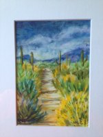
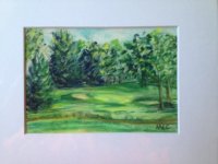
These are both wonderful, and since you enjoyed the process you're much more likely to keep having a play with the pastels, and sharpen your (already considerable) skills. :)

When it comes to the concept of "values," I struggled with it too, at first. I'm a photographer, first and foremost. When I saw this "grayscale version of the color wheel", as you put it, suddenly it clicked for me.

In photography, especially in B&W photography, we call this the tonal range. You know how a really good B&W photo can really draw you in? You notice the depth, the shadows, the highlights. (Think of a famous Ansel Adams landscape.) That's the tonal range, nicely spread from one end of that scale to the other. When it's not there, when a photo looks kind of the same gray tone throughout, we call it flat. We say increase the contrast, or whatever. But we're basically saying to increase the range of values.

It's the same concept, just different mediums, and thinking in color vs. B&W.

Hope this helps. :) And mad props for saying grok. I grok.
 
Back
Top