FEBRUARY 2023 WATERMEDIA CHALLENGE

ErikRak

Well-known member
Messages
154
Here are some personal photos that I hope will inspire you for this month of February challenge.
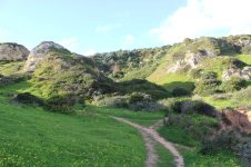
Some views of Portugal:
cswmc7_182011.jpg
cswmc9.jpg
cswmc6.jpg
cswmc5.jpg


Flowers in the park near my home:
cswmc6_110029.jpg
cswmc1_094729.jpg
cswmc1e78e676ba699d5d6b79.jpg
cswmce85844876b4d4cc23f7e2992434bf-V.jpg


Animals, my dogs, some cows,etc

cswmcac417a85228a03912abb14c8b19a2-V.jpg
cswmc6_103111_2.jpg
cswmc90618_172543.jpg
cswmc76190543eaa340db96ec63c12d3cb-V.jpg


Houses
cswmc5_121551.jpg
cswmc49f582971235d9e45c04d35ab6e15-V.jpg


North sea
cswmc71010_134215.jpg


And a dessert ;-)

)
cswmc623503f0fd93cfbbde04aa97fea7f-V.jpg
 

Attachments

  • cswmc4.jpg
    cswmc4.jpg
    288.6 KB · Views: 62
  • cswmc8_193147.jpg
    cswmc8_193147.jpg
    131 KB · Views: 65
Looks like I'm the first one to post!

I did the trees on the hill. This is ink and watercolor in XL MixMedia sketchbook. It's about 5" x 7".

I started with a freehand pencil sketch, added ink and then watercolor. Thanks for hosting this month Erik.

20230204Sk7 Trees on a Hill (Color) - WMC (CS).png
 
I like it! Well done, Kay! The loose and squiggly way that you handled the pen really worked to good effect in the area of the leaves.
My eyes want a little more contrast between leaves and sky, fwiw. Maybe another application of the green?
 
I like it! Well done, Kay! The loose and squiggly way that you handled the pen really worked to good effect in the area of the leaves.
My eyes want a little more contrast between leaves and sky, fwiw. Maybe another application of the green?
Thanks for you comments Lamar. I watched a video on drawing ink trees and tried the technique here.

I see what you mean about the contrast of the leaves against the sky. I looked at the original and realized the sky is bluer in real life than it is in the scan which helps quite a bit. I tried playing with the scanned image to see if I could get the sky bluer but I wasn't able to. I don't want to lose the light one the upper parts of the leaves so I don't want to just go stronger with the green.
 
I see what you mean about the contrast of the leaves against the sky.
Well, in my daily life I seek out contrast to help me navigate, so it may just be that I'm looking for it in art too. And anyway, your painting is very pleasing as is :) And it would be a shame to lose the more delicate light of those upper leaves!
 
I tried my hand at your park flowers that resemble lilies. Watercolor on 140 lb cold press Grumbacher paper using new Sennelier pan paints with a petal brush. I did a crop to focus on the main blooms. Size is 3x4 inches.

Portugal Lilies.jpg
 
Last edited:
Kay, I love the contrast of the red flowers against the green leaves. It makes them pop off the paper. Well done.
 
Back
Top