Trying watercolor. I generally use wc for small studies, 4×6, 5×7. I can probably count the florals I’ve done on one finger, so I’m really in over my head. All help is greatly appreciated. I’m in a painting group, and a member is instructing in wc over 4 weeks. Mon Nov 13 is the second day.
two weeks ago he gave the people there the photo to transfer. I used graphite paper as it was my understanding that is what he used for transferring. Last week there were about 10 more people showed up, so he gave them pictures and the time was spent having them do their transfers, by using a graphite pencil on the back, then tracing it onto their paper. I have mine ready to go for Monday. Those ready to paint, could. So I used mine and over the next several days did this:
11×14″ on Fabriano acid free hot press paper –I’ve never used hot press paper either…
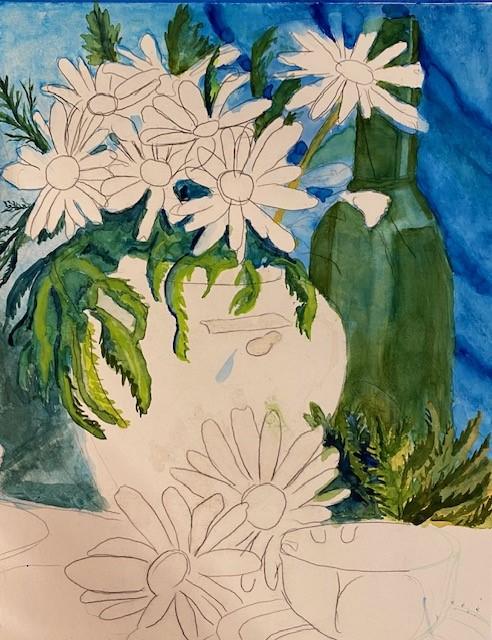
The blues are cerulean and thalo, in bottom V left, Prussian Blue over cerulean for the dark. Greens are sap, permanent green light, and hookers light, and a bit of yellow, (the dark greens) are Prussian blue. The flowers according to the photo ref are to be daisies, but I’m sorely tempted to make them Black-eyed Susans instead…

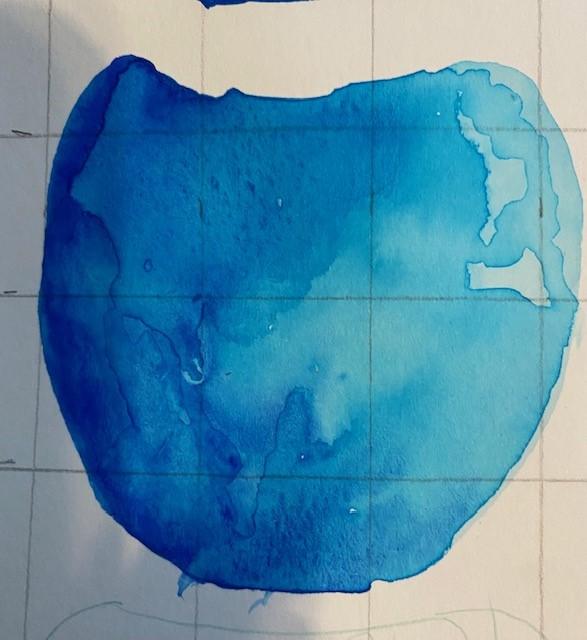
The next photo is my thinking of what I’d like to do with the vase, using turquoise and ultramarine blue. Light is coming from the right. Would a different color vase be better?
And what do I do with all those white petals!? I’ve started adding a bit of gray from cad orange and ultramarine blue where I think there should be shadows, should I use other complements for different grays, and if so, what?
Your thoughts? All suggestions welcomed. Thanks for looking.
two weeks ago he gave the people there the photo to transfer. I used graphite paper as it was my understanding that is what he used for transferring. Last week there were about 10 more people showed up, so he gave them pictures and the time was spent having them do their transfers, by using a graphite pencil on the back, then tracing it onto their paper. I have mine ready to go for Monday. Those ready to paint, could. So I used mine and over the next several days did this:
11×14″ on Fabriano acid free hot press paper –I’ve never used hot press paper either…
The blues are cerulean and thalo, in bottom V left, Prussian Blue over cerulean for the dark. Greens are sap, permanent green light, and hookers light, and a bit of yellow, (the dark greens) are Prussian blue. The flowers according to the photo ref are to be daisies, but I’m sorely tempted to make them Black-eyed Susans instead…
The next photo is my thinking of what I’d like to do with the vase, using turquoise and ultramarine blue. Light is coming from the right. Would a different color vase be better?
And what do I do with all those white petals!? I’ve started adding a bit of gray from cad orange and ultramarine blue where I think there should be shadows, should I use other complements for different grays, and if so, what?
Your thoughts? All suggestions welcomed. Thanks for looking.
 I am super impressed with how well all your greens have turned out. I can't wait to see how it looks finished. I personally love the color of how you want to do the vase, but maybe it's too close in color in the background? I wouldn't want to really suggest the color orange (kinda too obvious to pick that as a compliment), but perhaps it can be an orange base, or a brown-orange/rust-type color. Then pick up that Ultramarine blue on the surface area.
")
