Cobalt Curtains

JStarr

Well-known member
Messages
724
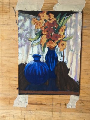
I LOVE interiors- I'd have a wall-full of interiors if I wanted to put that much effort into it- I just really like interiors. But I've never even sketched one- likely because I love them so much and don't want to screw up my love affair- classical 'fraidy-cat. But I took this pic of a couple of my cobalt pieces on the dining room table with the early morning light coming in the French doors, and I really liked them- the backlit shine in the glass and the backlit flowers-- yep- that'd make a good piece. Except there was a bit of chair there, and the French doors also showed, like, a bottom third of an ugly, sprawling tree (good for shade on the patio- not much else) and- no, that is the wrong background. But I remembered an interior I'd kept, just light and shadowed curtains with a tree outside it- yep- that would do. And so I tried marrying them together.

Took maybe an hour, fast sketching and trying to get values in place enough to read it as a ref (although I'll be glad for my artistic license) and trying different hue-layering for shadow tones on the curtains. This is about 8" x 10", and I really like it small- cause when it is opened big it shows a lot of tortured spots. It'll work as a ref though.

C&C welcomed before I start on the larger piece- let me know if it looks distorted or just wrong some where so I can get it right on the big one.

Thanks!
 

Attachments

  • cobaltcurtainsrefsktch.jpg
    cobaltcurtainsrefsktch.jpg
    126 KB · Views: 50
I love interiors too but avoid them because of my lack of perspective skills. This is such a nice composition and the shadows on the curtains add a lot of interest. Nice color contrasts too!
 
I love your blues! The deep blue shadows on the table are wonderful. Flowers and vase look fine, and I like your setup with the vases.

I'm looking at this on my phone, so apologies if I'm reading it wrong - trying to get the placement of the curtains in my head. I think only seeing the tabletop is throwing me (no legs). The windows are right above the table, which is in a corner, and the shadows of the tree outside are dancing across the curtains.

It all looks good to me, just maybe a tad more table to help ground the surrounding curtains. Hope that makes sense! :)
 
Thank you, Donna- but what if you find you do them really well? I mean, you should try at least one to see if you have the interior-bent.

I thought I might fit a table edge and bit of under-space in, too, Terri- good eye, thank you for confirming that.

I might get to at least hinge paper to the easel tomorrow, but more is less assured. We are apparently going to trim the hedge *inside* the fence tomorrow morning while it is (ha!) cool, and then I'll be wiped for awhile. That kind of balance-intensive work takes my legs out from under me.

Plus smoker-roasted chicken for supper with 'tater salad and fried corn. That'll take some doing, too! Maybe next week.

PS: As terrible as this sounds, hope that the tropical "disturbance" in the Eastern Pacific actually moves up the coast of Mexico and right up into the Gulf of California- as a low grade hurricane would be perfect. We REALLY need rain, and monsoon has shut down. The tropics are our only chance now.
 
I think this is going to make a delicious painting. I love the shadows and the complements of the blue and the yellow/orange/rusts are just perfect. Will await the final outcome. ❤️ :giggle:
 
That blue again--luscious! I also love interiors. Do you like Diebenkorn by chance? You made me think of him and he is one of my all-time favorites. This is a beautiful piece. I am loving your work. Keep 'em coming. Can't wait to see the final. ♥️
 
That blue again--luscious! I also love interiors. Do you like Diebenkorn by chance? You made me think of him and he is one of my all-time favorites. This is a beautiful piece. I am loving your work. Keep 'em coming. Can't wait to see the final. ♥️
Diebenkorn is able to abstract far better than I, but yes, I really like his work. I also like Jessica Brilli- being able to take a scene, a *composition* and reduce it to just the perfect, necessary shapes is such a wondrous skill!
 
That blue again--luscious! I also love interiors. Do you like Diebenkorn by chance? You made me think of him and he is one of my all-time favorites. This is a beautiful piece. I am loving your work. Keep 'em coming. Can't wait to see the final. ♥️
Perhaps, given the number of folks saying "I love interiors", there should be an "Interiors" sub-forum.... Might get these professed lovers moving inside some :love::love::love:

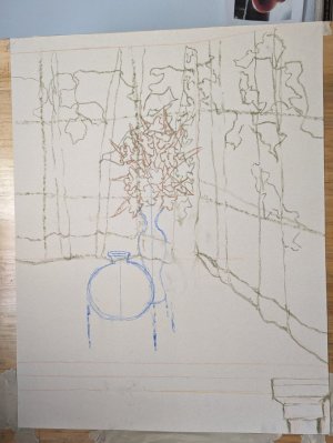
Here's the sketch in a couple bits of hard pastel; I would appreciate linear-perspective eyes on the curtain/ceiling lines, and the table/right side curtain line. I don't want to have to brush off a huge swathe when I'm two thirds done just to fix a line that should have been blocked in correctly in the first place! (Also, may put an about half or so of a table leg on the left-bottom. It'll be according to if the comp needs weight there).

600 grit Blonde UArt, 21" x 27"


No pressure, amirite??
 

Attachments

  • cobaltcirtains01sktch.jpg
    cobaltcirtains01sktch.jpg
    100.2 KB · Views: 45
Last edited:
There's that table leg! :LOL:

This sketch looks great. The curtains and ceiling looked fine in the first sketch: my only question was getting more information on the table. :)

No, no pressure at all! Looks to me like you have it right in your head, which is the most important. You can get to it at your leisure - sounds like you have some outdoor projects to get to. Stay safe in that heat! Hope you all get some rain soon. 🌧
 
I waaay increased the size of the vases and bouquet- the quickie ref is in-your-face and that's one reason it works- but it's because the vases are so forward and, well, in-your-face.

It's coming along in a sketchy, hard-pastel base-block-in; tomorrow is appts and a hair cut for DearHusband, and maybe lunch- no telling if I'll get to it.

He needs to go into the garage and make frames or something.
In other words, stay out from under your feet. :LOL:
 
Diebenkorn is able to abstract far better than I, but yes, I really like his work. I also like Jessica Brilli- being able to take a scene, a *composition* and reduce it to just the perfect, necessary shapes is such a wondrous skill!
I love her work! Thank you for that introduction!!! ♥️ I will be revisiting her site. ♥️
 
Perhaps, given the number of folks saying "I love interiors", there should be an "Interiors" sub-forum.... Might get these professed lovers moving inside some :love::love::love:
I think that's a good idea, I just wonder if some people will have a hard time picking between still life and interiors at times, but I will consider that. It's a good idea. :) I'll figure something out.
 
I think this is beautiful. My only critique - two blue vases makes it too matchy-matchy for me, I think they compete with each other. Maybe lighten the value of the back vase some, to push it back a little? Of course, it could just be how that shows up on my screen and not in real life.
 
I think that's a good idea, I just wonder if some people will have a hard time picking between still life and interiors at times, but I will consider that. It's a good idea. :) I'll figure something out.
You could include Exteriors, too, and call it "Architectural Elements" ;)
 
I think this is beautiful. My only critique - two blue vases makes it too matchy-matchy for me, I think they compete with each other. Maybe lighten the value of the back vase some, to push it back a little? Of course, it could just be how that shows up on my screen and not in real life.
Thanks- I see what you mean. The back one will likely go darker as it is not real cobalt glass, just a dark-dark blue with a shape I liked. Looks female- which is why it needs the flowers.

(ooooooo! *Idea*!! Wait-wait-wait- get this one done first....)
 
Back
Top