You are using an out of date browser. It may not display this or other websites correctly.
You should upgrade or use an alternative browser.
You should upgrade or use an alternative browser.
Vicky, Missy & Gizmo
- Thread starter Nikki
- Start date
Enyaw
*****
- Messages
- 9,352
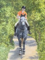
Composition wise the horse and occupants are coming down the middle. I think if they were coming down one the horizontal thirds it would work better. Cover your canvas just to the viewer right of the girls boots and you will see the composition I am talking about. Your rendering of the occupants is very well done.
Jo Castillo
Well-known member
- Messages
- 5,052
Your painting is great. I love the way you did the figures. Excellent horse. My critiques are for future ideas. I agree on the composition. The trees behind her could be a little bluer/cooler and that would make more depth on the trail.

Joy
Well-known member
- Messages
- 2,212
Nikki, the subjects are outstandingly rendered! The dappled color on the horse is impressive. Also, the shadows on the path are beautiful and very natural. I agree with the compositional advice. For me, there is so much of the same hue and value of the green it "takes over" the painting. The idea of a blue wash is very good, and perhaps some more lighter areas in the foreground greenery, darks in the distance, and less detail in general with the surrounding greenery. The foliage is all the same level of detail.
Thank you!This is an excellent painting! I agree with what others have said about the greenery, but personally I like the strong central composition.")
Terri
Moderator
- Messages
- 4,777
Hi Nikki! I like your painting a lot - your rendering of the subjects is very good. What a fun trio to paint!
I agree with the others. I'm more of a photographer than a painter and, in photography, we talk about contrast, which is the same concept as values in painting. There's a sameness in your contrast here that makes it flat, to use photographic language. I agree that the addition of deeper blues in the background will add increased depth (via contrast) and push your charming subjects forward. Maybe a few dashes of sunshine colors and darkening the edges would punch it up, too.
The composition isn't bothering me because it's clear that the viewer is looking straight on at the subjects. I love the one lifted hoof. Excellent work on your horse!
I agree with the others. I'm more of a photographer than a painter and, in photography, we talk about contrast, which is the same concept as values in painting. There's a sameness in your contrast here that makes it flat, to use photographic language.
I agree that the addition of deeper blues in the background will add increased depth (via contrast) and push your charming subjects forward. Maybe a few dashes of sunshine colors and darkening the edges would punch it up, too.The composition isn't bothering me because it's clear that the viewer is looking straight on at the subjects. I love the one lifted hoof.
Excellent work on your horse!Thank you so much! Your photographer’s perspective is a valuable add.Hi Nikki! I like your painting a lot - your rendering of the subjects is very good. What a fun trio to paint!
I agree with the others. I'm more of a photographer than a painter and, in photography, we talk about contrast, which is the same concept as values in painting. There's a sameness in your contrast here that makes it flat, to use photographic language.
The composition isn't bothering me because it's clear that the viewer is looking straight on at the subjects. I love the one lifted hoof.

Thank you!Wayne is correct about the rule of thirds in composition. Read up on the "golden mean". And there are many tutorials on the different types of composition. However, that said, this is a beautiful painting and very well done. I love it.
Thank You!I think this is amazing and super well-rendered for sure. I don't mind all the green. It may be too symmetrical is all. That would be my only crit. Otherwise, very well done!!!
Wayne is correct about the rule of thirds in composition. Read up on the "golden mean". And there are many tutorials on the different types of composition. However, that said, this is a beautiful painting and very well done. I love it.
Mississippi Hippie
Well-known member
- Messages
- 1,128
its refreshing to see a down the middle comp to me... so i do like it.. something seems smooshed.. the paint and the light tones meeting the green.. otherwise the subject just is amazing and makes me happy... so no way it is unsuccessful
Thanks much! Not sure I fully understand what you ean by smooshed…where the path meets the green, or the riders’ pants…, or…? I really do appreciate your feedback, just trying to make sure I understand your point.its refreshing to see a down the middle comp to me... so i do like it.. something seems smooshed.. the paint and the light tones meeting the green.. otherwise the subject just is amazing and makes me happy... so no way it is unsuccessful
Similar threads
- Replies
- 34
- Views
- 797