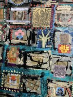
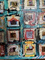
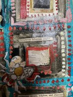
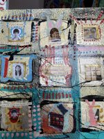
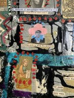
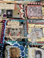
Just now discovered your wonderful piece. Wow - all that crazy text came from1930's news papers! What the hell were they doing back then! Really curious to read the articles the pieces came from.
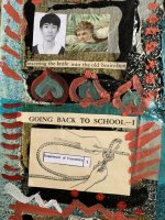
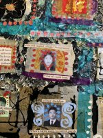
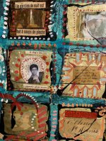
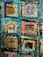
The same materials given to less capable hands could easily have been a disaster. You made some great choices in the assembly - the layout and color schemes hold this piece together. If you had arranged the pieces overlapping or in a helter skelter pattern much of the impact would have been lost. And the choices of images! The grid structure allows us to examine each one, and suggests some kind of gestalt linkage - and makes the piece much more dynamic on the wall. The colors too were the right choice. Some of the text combined with the images would seem too gruesome/dark/somber if set against a dark,, black or grey bg. The colors are just bright enough to assuage our guilt without making a parody of the text,
Wonderful piece.