Help please. I'm stuck.

JennieJo

Experimentalist
Contributing Member
Messages
1,520
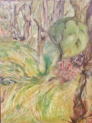
I've been looking at this, testing colours but haven't been able to get the right mix of yellow and green tones for the leaves on the right. I can sketch them with pencils and pastels and get close to what I want, but can't transfer it to this. And, I can't work on the rest of the image until I get the colours right. My plan is to just paint over the leaf interiors with a light yellow and build it all again. I'm worried that I'll need thick paint, and the layers I'm using now are thin.

1000016674 (2).jpg
 
I think I see what you’re saying, JennieJo, and I wonder if it’s more of a contrast issue than a color issue. What about something like a thin, cool wash of blue or blue-violet to the area behind the leaves to push it back and make the leaves stand out? Some kind of neutral transparent layer behind the leaves might work if you don’t want to introduce more colors to your palette. I like the flowy yellow greens in the foreground!
 
I think I see what you’re saying, JennieJo, and I wonder if it’s more of a contrast issue than a color issue. What about something like a thin, cool wash of blue or blue-violet to the area behind the leaves to push it back and make the leaves stand out? Some kind of neutral transparent layer behind the leaves might work if you don’t want to introduce more colors to your palette. I like the flowy yellow greens in the foreground!
Wish I read this yesterday.l have played a bit will try your ideas tomorrow. They are so helpful.
 
Maybe it’s too late now. But I ran into this problem with a landscape I did. I ended up changing it. The big leaves at the front on the right side need to be darker. They are closer to you in the back landscape looks like you want it to be lighter as if it’s in the sun. It’s a little bit like looking out through the bush or the tree where you’re standing out onto a field or onto the landscape that’s lit. Otherwise it’s gonna be very confusing if it’s very close to the same colour as the mid ground and the background. So more greens less yellow don’t be afraid to go darker. It’s gonna help frame the background.
 
Maybe it’s too late now. But I ran into this problem with a landscape I did. I ended up changing it. The big leaves at the front on the right side need to be darker. They are closer to you in the back landscape looks like you want it to be lighter as if it’s in the sun. It’s a little bit like looking out through the bush or the tree where you’re standing out onto a field or onto the landscape that’s lit. Otherwise it’s gonna be very confusing if it’s very close to the same colour as the mid ground and the background. So more greens less yellow don’t be afraid to go darker. It’s gonna help frame the background.
Thanks. The sunlight is the issue I can't get my head around
 
Sorry, I might be a bit confused. Where do you want the sunlight? I thought it was more the middle ground you wanted sunlight. And you had to distinguish the big leaves in the foreground from the sunlight area, which I think is grasses. Is that right?
 
Christine, have just seen this post. I'm done! But yes you were done. Don't think I'll be doing one of these again! Don't the best pic. It is a bit unkind But you'll get the drift.

sm-1000016817_edited.jpeg
 
Hi Jennie, sorry you didn’t enjoy it? Well when we have paintings that we go through the wringer trying to figure out, that’s where we learn a lot. Even if sometimes you’re not sure if it was 100% successful. It’s always good to try different things and see how works out. And sometimes you have to try different versions to see what you like and what works.
This has a softer look and it’s different attributes are things you can learn from compared to the first. I like the first one too. It’s very strong and dynamic, but that was throughout the whole painting, and it was hard to know what to focus on. This softer version makes more sense to my eye. And that right hand leaf is a little more solid even if it isn’t the darkest color, it shows me that it’s in the foreground. So I think you did a pretty good job resolving this. It may not be perfect to you yet or it may have been very difficult. But it’s depends on what you wanna go for in a painting. Some people would like the first picture because they like a lot of dynamic lines and colors, but it can be quite chaotic. Abstract expressionism. Your second version is not chaotic but still with a lot of expression. That may be more pleasing to viewers. Both works have a lot of life in them! Hope you don’t mind me giving you my two cents.🙂
 
Hey you got unstuck so that's great! I like both versions too. This latest one does feel softer and a little more refined. What a complicated subject but you did it!
 
Thank you ladies. I think I'll be looking at it for a few months before decide trash or fix more.
 
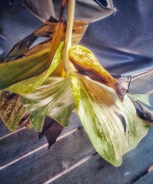
Had an idea I might test to see if it makes the area to busy + distracting, or getting rid of the big demanding leaf is a good thing. Got some pruned leaves and strung them up in my work area. I'm going to paint a version of them in.

IMG_20250526_125135_HDR.jpg
 
Back
Top