Craggy Mountain exercise

jmfletch

Well-known member
Messages
941
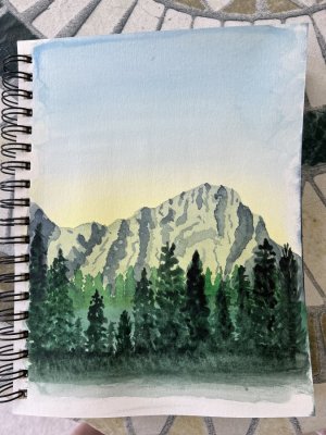
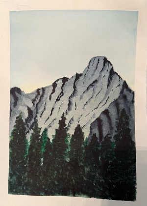
Painted this in 7x10 inch Canson watercolor sketchbook. Now that it is all dry I think the first layer of tress could have used some detail and mountain could have used another layer. Please feel free to comment, critique or provide constructive criticism.

Also seeing it here I like taping a frame to give clean edges. Also for some reason I could only attach.

Fletch
 

Attachments

  • IMG_2445.jpeg
    IMG_2445.jpeg
    149.7 KB · Views: 45
That's a nice piece.
IMO, there's not enough light on the 4 front trees on the viewer right, and no variety of light/dark on the distant trees. Both easily adjusted, I think.
 
I really like how you handled the shadows in the mountains. Well done work overall. And good composition. ♥️
 
I agree you might lift a little color for highlights the front trees. I think the mountains are great and more color would bring them forward. Nice distance as they are. Well done as it is!!
 
Yup- lift some colour off the right front tree- just the one closest to the middle so you don't draw the eye right out of the frame; alternately, if you can lay in a bit of yellow in a transparent layer (*I* know what I mean, but I've never been able to figure out why sometimes, you can layer wc in glaze-like layers, and sometimes when you try that, you lift the bottom-most layer right off! Who knows??) onto just the upper edges of the right-front sweet-spot trees, that draws the eye on in.

Also, very carefully, moisten and lift the 'line' on the top of the lightest bits of the crags- those should sort of melt into the sky. Makes 'em look even higher.

I really must congratulate you on this- I mean, wow! That's a lot of value to have to control and you did it really well. Payne's gray is good for that.
 
Sometimes, too, you can do a new painting with the things you like from this one and learn even more. You did say this was an exercise. I think it is a keeper, just suggesting for a future painting.
 
WOW. THank you all for taking time to stop and encourage with your words. Also deep thanks to those who provided tips and suggestions. Constructive criticism is valuable learning to me and much appreciated.
Working up the nerve to try the suggestions. I know it is an exercise and way to learn but I really am happy how it turned out in general and want to try suggestions but also afraid I will mess it up.
 
Working up the nerve to try the suggestions. I know it is an exercise and way to learn but I really am happy how it turned out in general and want to try suggestions but also afraid I will mess it up.
So don't do anything to this one- instead, tack it up where you can see it from your easel space, and try it again- a whole new piece. The reason you keep it where you can see it is so you can learn to see how to get the effects you want- because you've got some amazing stuff going on here. This is how many artists work: Doing the same 'thing' over and over, seeing where they can improve and how.

How many self portraits did Rembrandt do?

One hundred.

You have 99 more iterations of this to go if you want....


WOW. THank you all for taking time to stop and encourage with your words. Also deep thanks to those who provided tips and suggestions. Constructive criticism is valuable learning to me and much appreciated.
Working up the nerve to try the suggestions. I know it is an exercise and way to learn but I really am happy how it turned out in general and want to try suggestions but also afraid I will mess it up.
It's hard for me to give any constructive critique because I don't use the medium. I will say that I think your palette is overall very good, and your background mountains are extra gorgeous. I don't think you need to change a thing there!

In general, regardless of media, variety of color in the foreground can be desirable. You've done that here, but I like Jo's idea of creating some highlights by lifting the color. I don't know what that term means, but I do understand adding some highlights to the foreground and think that's a valid suggestion.

This looks beautiful overall, and your composition is wonderful. ❤️ You're doing great with these exercises! I'd leave it be and use it as a reference for the next one!
 
Jstar, Thank you for some great guidance! And the link!

Terri, constructive criticism provides wonderful lessons, but you just taking time to comment is very encouraging and appreciated.
 
Last edited:
I redid this exercise with a goal of incorporating tips and suggestions.
Ii really like the sky and mountain but kept piddling with the trees and produced a very different image without the glow of the previous effort. The page is buckled a bit in photo which I did not notice until I resized it.

Fletch
 

Attachments

  • IMG_2102.jpeg
    IMG_2102.jpeg
    195.9 KB · Views: 24
You did really well on both versions of the mountain. I agree that you need some highlights on the foreground trees to make them stand out more. Also you have very hard edges everywhere in the paintings. You should soften an edge here and there and let it be a softer line in a few small spots. Right now it works pretty good because you have craggy, hard rocks on the mountain so the hard lines work. I don't know if you've touched on softening edges yet in the lessons you're doing. I'll see if I can send you something and show you what I mean.
 
You did really well on both versions of the mountain. I agree that you need some highlights on the foreground trees to make them stand out more. Also you have very hard edges everywhere in the paintings. You should soften an edge here and there and let it be a softer line in a few small spots. Right now it works pretty good because you have craggy, hard rocks on the mountain so the hard lines work. I don't know if you've touched on softening edges yet in the lessons you're doing. I'll see if I can send you something and show you what I mean.
Need the thousand mixes of green you use so beautifully. Also apparently need to learn how to use quality of line with a brush; it is instinctive with a pencil.
 
Last edited:
Wow, I love both images... lots of my own memories seem embedded in this scene, so beautifully done both times.

I also love this thread for the interesting notes, and tips on working with scenes, as well as for working with watercolor.

Can't add much, but I will say that as I first looked at your original painting **and before I read any comments** I was looking at the trees and enjoying each of them, with all their variety. That is so real to me having spent so much time hiking different forests in my country. Some (though not all) corners of our forests seem to have tremendous variety, to the point where each tree in a tight stand of trees seems to be a slightly different species than the others... I love that variety, and was just amazed at how beautifully you differentiated your unique trees in that original effort, without it becoming overly obviously or exaggerated...

Well done indeed 👏
 
Back
Top