You are using an out of date browser. It may not display this or other websites correctly.
You should upgrade or use an alternative browser.
You should upgrade or use an alternative browser.
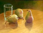
Still life with pears
- Thread starter P. Barrie
- Start date
P. Barrie
Well-known member
- Messages
- 802
Thanks to all for commenting.
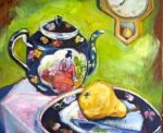
For more insight into color mixing, the palette as I remember, was: zinc yellow, primary blue (PB 15), not remembering the red? possibly Naphol, Burnt Sienna, and Ultramarine. Color seems a bit raw to me. With this in mind. what color relations might I have come up with to make it more convincing and less contrived?
For more insight into color mixing, the palette as I remember, was: zinc yellow, primary blue (PB 15), not remembering the red? possibly Naphol, Burnt Sienna, and Ultramarine. Color seems a bit raw to me. With this in mind. what color relations might I have come up with to make it more convincing and less contrived?
P. Barrie
Well-known member
- Messages
- 802
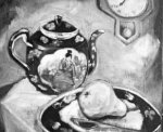
Patrick, It's the values that require attention, not the colour. If it don't look right, it's always value.
Ps...don't shoot the messenger ☺
Maybe values could be broader. Perhaps the form shadows on pears could be darker. However, values can be good and color can still be out of harmony.
Desforges
Well-known member
- Messages
- 1,295
I think that my pear was a little naive.Beautiful Jocelyne.


 ❤
❤


