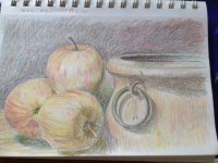
My first real CP

Hostajunkie

Well-known member
Messages
202
I finally tried to do an actual CP piece -- a still life from a photo. The subject may be recognizable from one of the WC WDEs, but I no longer have a copy of the ref. photo. I remember the ref being very muted in color, so I was light-handed with the CPs. I used Prismacolor CPs in a Strathmore sketchbook. I was actually very pleased that it looks like something!!! This kind of piece is way outside my comfort zone. I'm thinking that paper isn't the best though. What paper/base do you use for CPs?
 

Attachments

  • apples_CP_IMG_6021.JPG
    apples_CP_IMG_6021.JPG
    141.8 KB · Views: 141
This is really good! I use practically anything, Bristol, or anything hot press. I love all kinds of paper, but I like them to be at least #80 for colored pencil if not way more.
 
Thank you, Artyczar! I'm afraid to try again because I'd hate to have a total failure. :p Your info is very helpful! I checked and the sketchpad is 50lb.
 
That’s very good, Hostajunkie. I like it a lot. You could go on adding layers of colour as that is the way to deal with coloured pencils, slowly building up,colour. It could be that the paper you used doesn’t take many more layers, though. I use an uncoloured blending pencils, cotton wool or paper tissues to smooth and blend.

I like Bristol board, or Bristol Vellum,drafting film and Pastelmat (but that eats pencils). I have also purchased, in the past, a pad of paper designed just for coloured pencils.

Keep going. It really is a very good start. Certainly don’t give up, it’s much better than you think it is.
 
Fear is the worst. I fully get that. But do not be afraid to fail because that is part of the process. Sometimes I have to go in expecting to make something terrible so I can make myself start. Being frozen in fear is the worst. There is a pretty good book called Art & Fear (a short read) that was very helpful to me.
 
I painted the same one with oil's. i'm sure i have the reference photo.
 
Hosta, That is really well rendered. To my surprise, that is the exact ref phot we are using at WC for the Watermedia challenge, here! I am working on it now. Just a few more dark values would help. I don't do CP, just watercolor. Here is the ref photo -

brcmptfb6rmyabsmqsvr6vp9cuy9um7u.jpeg
 
Nicely done so far but you could take it farther with more layers if the paper can take it.

When I worked in CP, I used Stonehenge.
 
You have a beautiful drawing. I'm not patient for cp, I want instant so go for ink and pastels. Ha. This is so nice, hope you find your paper. I've no advice on that.
 
Hosta, this is nicely done. I think though you could push the colors/tones without losing the muted quality. I'm doing this in watercolor pencils so it'll interesting to see the differences.

Joy, good to see you here on Creative Spark.
 
Back
Top