Need a watercolor/animal person's opinion.

CMorPaint

Well-known member
Messages
277
When doing a group of zebras, should I be painting the stripes on the front zebra with a red/black mix and paint the background zebra stripes with a blue/black? Will that help with depth in the painting? (I am asking because I just about finished a zebra painting and feel the depth is off - not happy with it and don't want to post it!)
Hope I asked this properly.
 
Last edited:
I completely understand not wanting to post what you don't feel is your best effort, but it would likely help experienced watercolor artists here to help you through it. It's hard to envision (for me, anyway). I'm sorry you're struggling a bit, because I've seen terrific work from you and I know you're quite talented. ❤️
 
Here it is...
 

Attachments

  • 20211130_175821.jpg
    20211130_175821.jpg
    146.5 KB · Views: 134
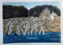
Cindy - IMO, the zebras are well painted! Anything equine is notoriously difficult, and doing three of them is really laudable. The body shading is nice. The way you portrayed thinner stripes for the legs and as they were receding down the body is convincing. Also, the one resting has lighter stripes, which pushes it back. You may want to consider making the stripes of a mixture of browns and mixed "black" from complementary colors, saving the darkest "black" for the eyes. The mane may be warmer and color farther away from the head attachment, as light is shining through that area. Of course, cool colors recede, so that is a good idea. Possibly what is taking away from the zebras is the very dark land masses the are too similar in size. The way they meet in the middle of the pale sky and form a "V" is drawing the viewer's eye away from the subjects. Plus the "V" points to the back of the zebra. The artist may want to pick one zebra to be the COI, even if the ref photo shows them all in equal detail.

I really applaud you for taking on such a difficult subject. Even though I enjoy painting animals, they are tough and it is frustrating more often than not.
 
I think the zebras are all well painted but the thing that steals the depth for me is that the reclining zebra is almost larger than the foreground zebras. Not much you can do about that at this point, watercolor is not as forgiving as some other media. All in all the painting is well done. (y)
 
I think the Zebras are well done and not really the depth problem. To me, the foreground water, midground riverbank, and background structure all appear flat and on the same plane of depth. Particularly the background structure is too dark value. Depending on the paper characteristics and quality, you may be able to lift some of the pigments. Black pigments (Pbk) are particularly hard to lift.
 
Oh my goodness, I so appreciate the input on my attempt of a decent zebra scene. I was reaching a level of frustration with it yesterday and had to ask for help. (Problem is I should have asked sooner - like when I was sketching the b/g.) I am learning from this and will try again.
Joy - Thank you for the tips on what looks off and the helpful hints to think about for the next one. I am going to try and lighten the b/g a bit to see how it will look. 🤔
Artyczar - Thank you
Snowball- I had the same thought after I posted it. The back zebra should have been smaller, (would have helped). Next time...
P.Barrie - Thank you, I appreciate your help. I am going to try and lighten the b/g today. I feel it is ruined anyway so now I can learn from it.
 
Cindy, all in all, the zebras look good. I find it helpful to first be critical of my ref photo before I paint. That is, think about what could be improved about the composition of the photo, instead of copying it exactly. As an experiment, you could try lightening the dark BG, and cropping in a bit. Although I have a terrible tendency to overwork, wiping off and reapplying. I joke that most of my paint ends up down the drain!
 
Cindy, you could use opaque gouache to overpaint the too dark values. I usually end up regaining the “lost” highlights with gouache when watercolor washes obscure the glowing white of the paper. White gouache is commonly used by WC painters, especially if not using masking technique. Gouache can be tricky as it reacts with paint beneath it and dries either lighter or darker than it appears when wet. Best to practice your objective some on scraps of paper prior to the piece.
 
Last edited:
I tried lightening the b/g and it did help a bit. I love painting zebras but I think a few classes on composition would really help me. I made up this one and I can see now where it needs improvement. Thanks for the tips and your kind words as well. It all helps. I have attached a copy with some of the b/g rocks lightened but I need to start over. (Black w/c paint is hard to lift and I do not have gouache.) I am still learning and enjoying it. 😉
2021-12 Zebra 3.jpg
 
A great improvement, Cindy! This is not an easy scene. Your zebras look great, and I love the motion of the water around them. Really nice! (I couldn't reply any more than I did, because watercolor escapes me completely.) ;)
 
Back
Top